Weever.ai: AI Shopping Assistant
Uncovering what makes users trust in an AI Shopping Assistant
Role
UX Researcher
Industry
AI
Duration
2 months

Weever AI is an AI shopping assistant that pulls real user reviews to give users unbiased product recommendations.
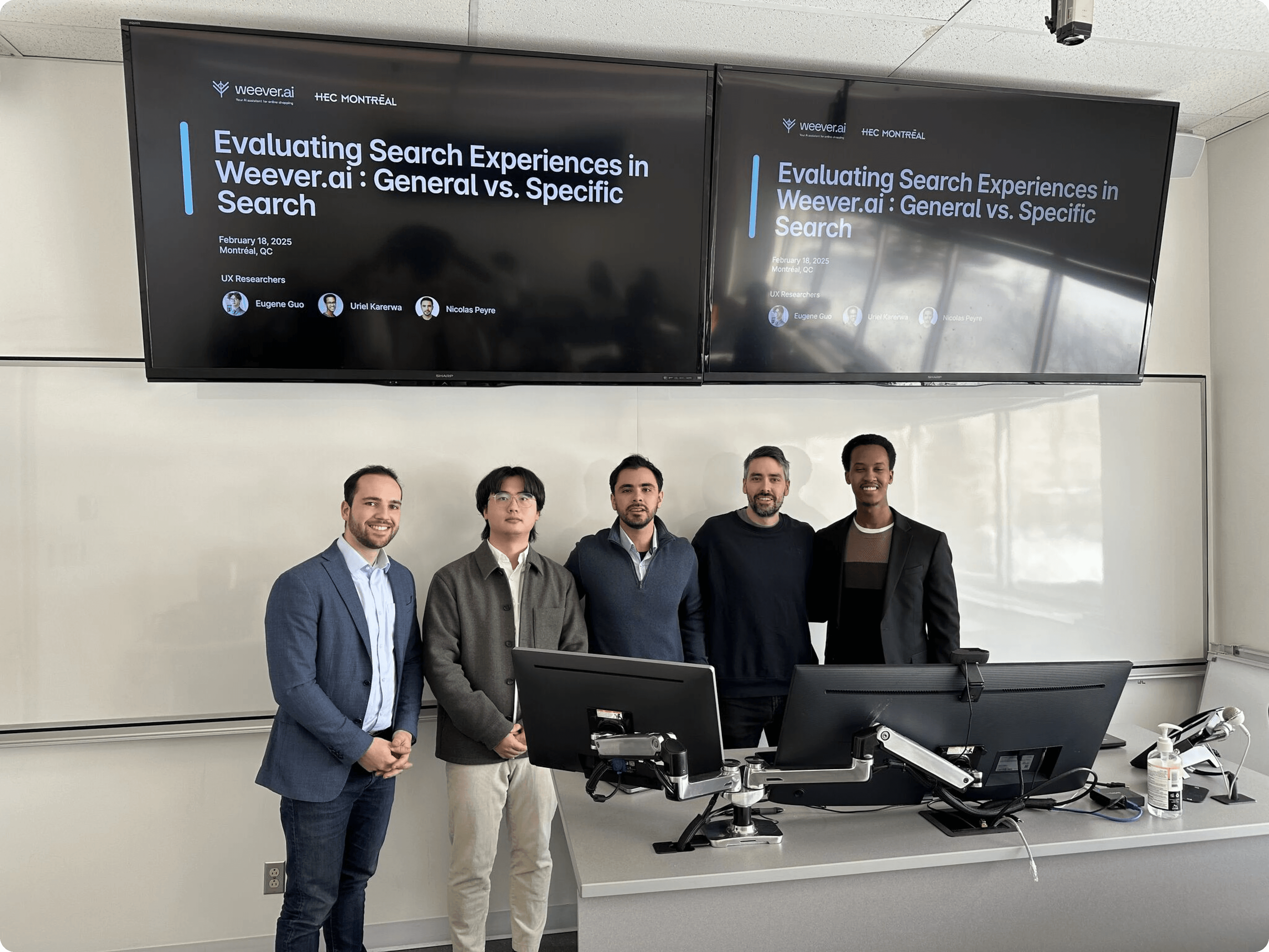
I was part of a three-person UX research team from HEC Montréal brought in to evaluate the platform and present findings directly to the CEO of Weever, Frédéric Marcoux.
Working directly with Fred, we ran usability tests and user interviews targeting young adults in major Canadian tech hubs. We mapped how people were actually using the platform, found the weak spots, and figured out how to turn browsers into buyers.
The core concept was strong, but the platform had an 18% bounce rate and users weren't converting.
Our research uncovered four core pain points:
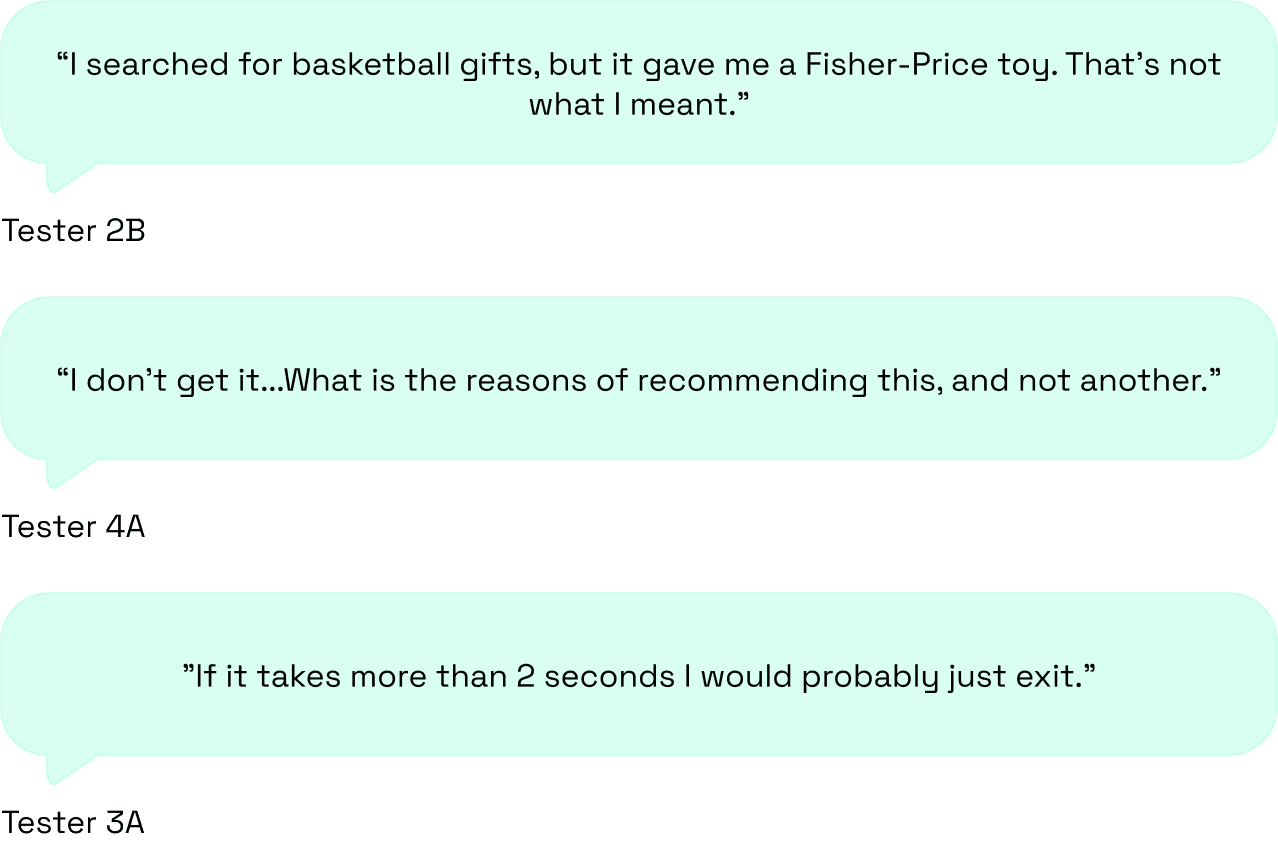
 Irrelevant search results 12/12 testers got recommendations that had nothing to do with what they searched for. |  Slow loading times 12/12 users would rather leave than wait. The wait was long enough to lose everyone. |
 No transparency 7/12 users lost trust because the AI never explained why it was recommending what it was. |  Limited results 8/12 users expected more results when conducting a search. |
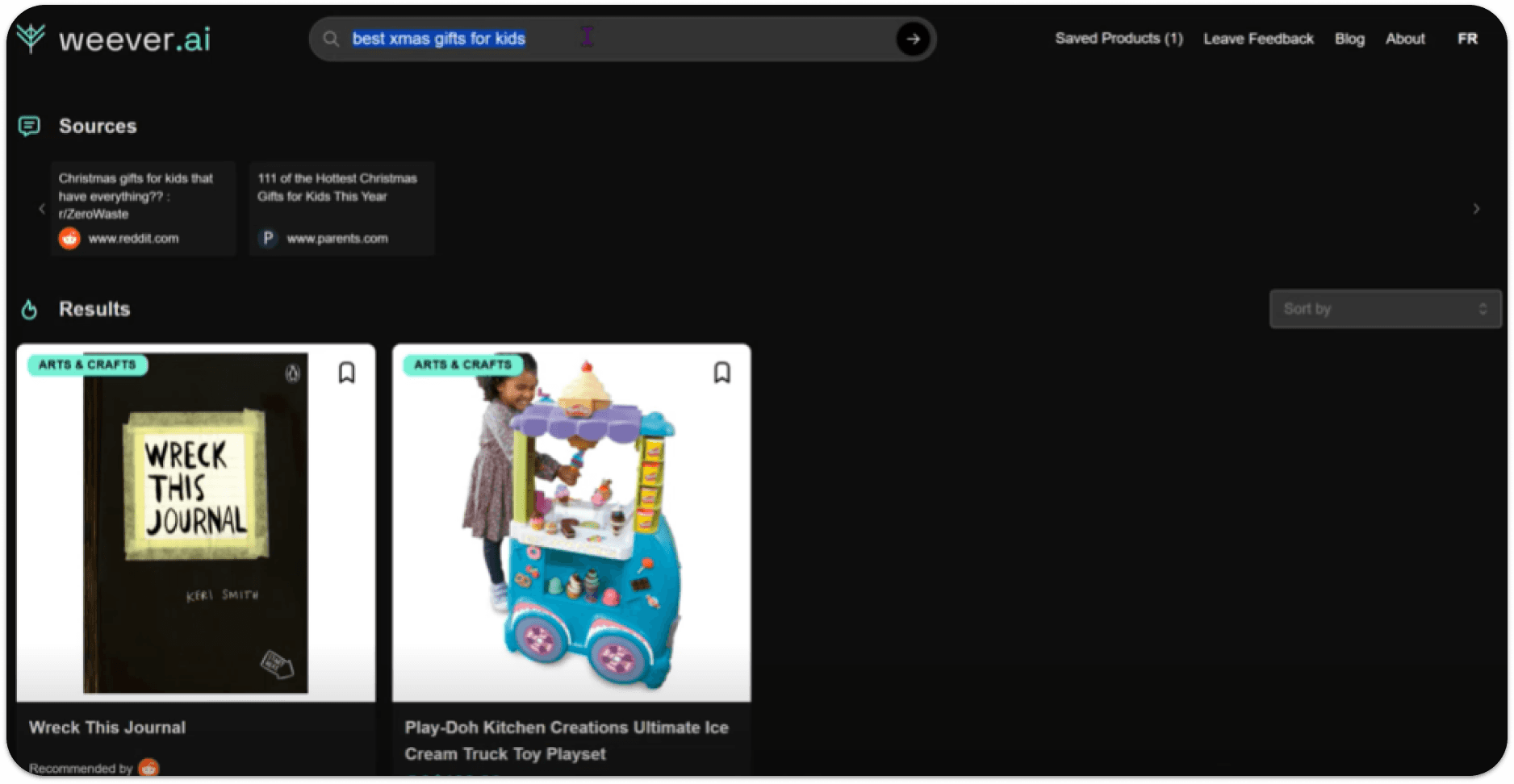
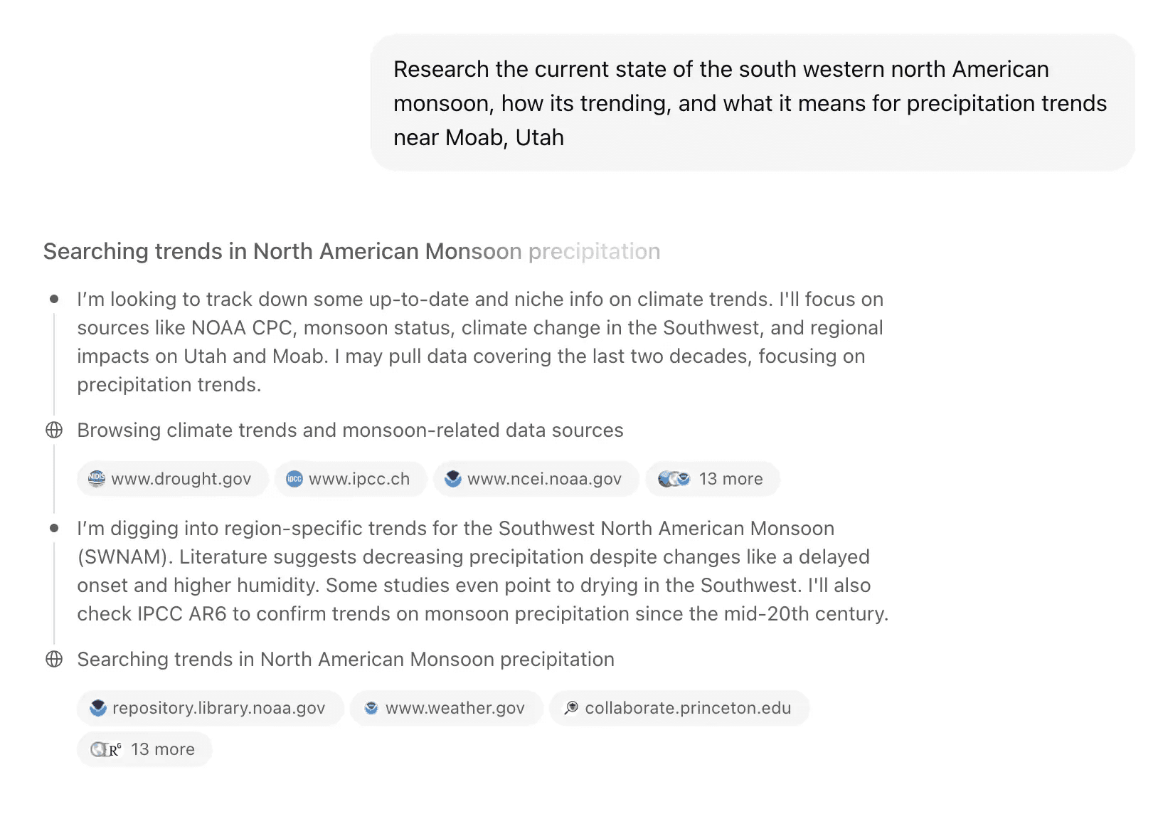
WEEVER AI SEARCH RESULTS
The goal was clear: figure out why people were dropping off and what was stopping them from actually buying.
To do so, we established three main objectives:
 Goals |
|---|
|
|
|
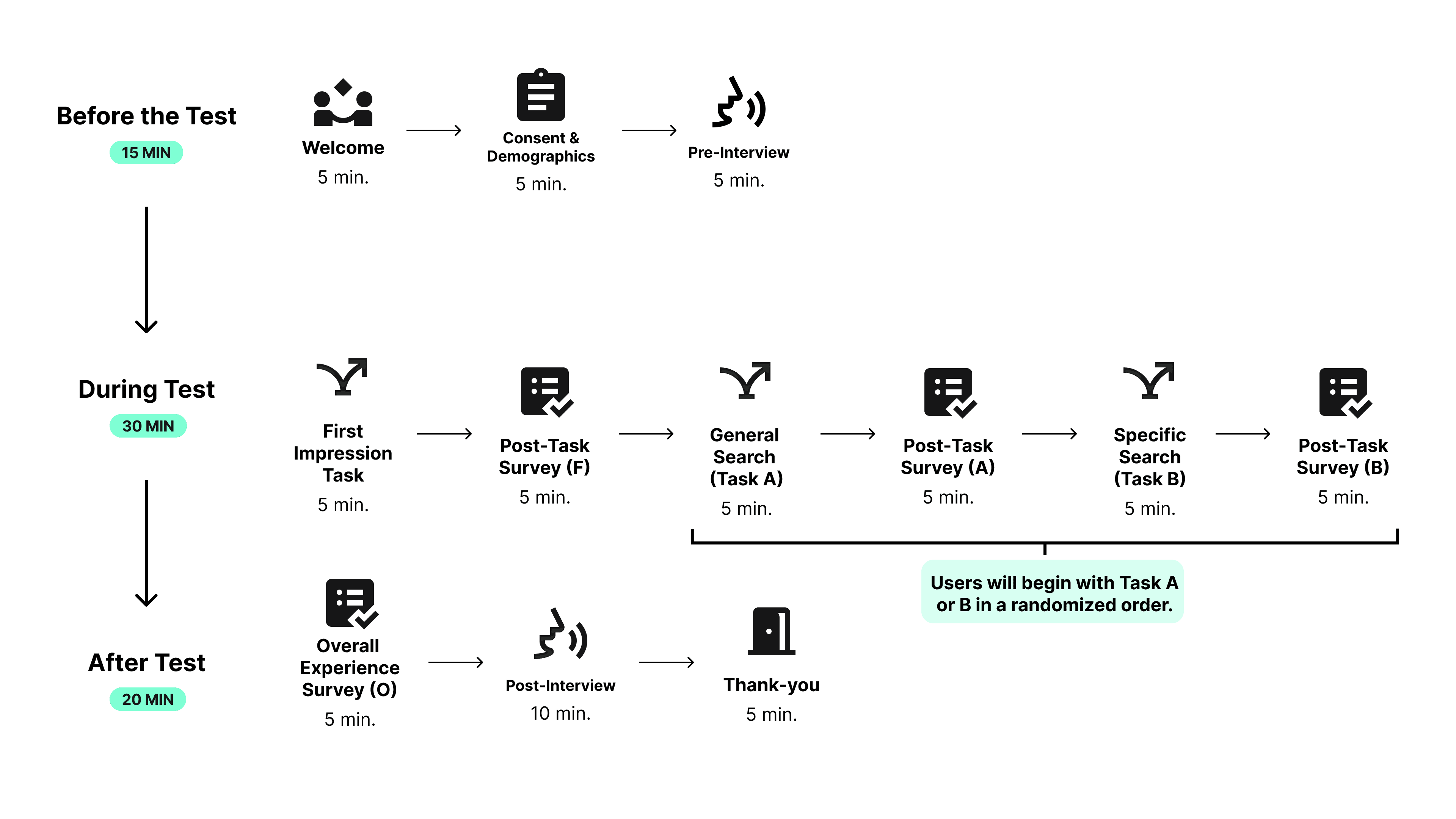
To understand how users were experiencing the platform, we ran a usability study and conducted user interviews with 12 participants.
People shop in completely different ways. So, we had all our testers evaluate the platform through two different lenses:
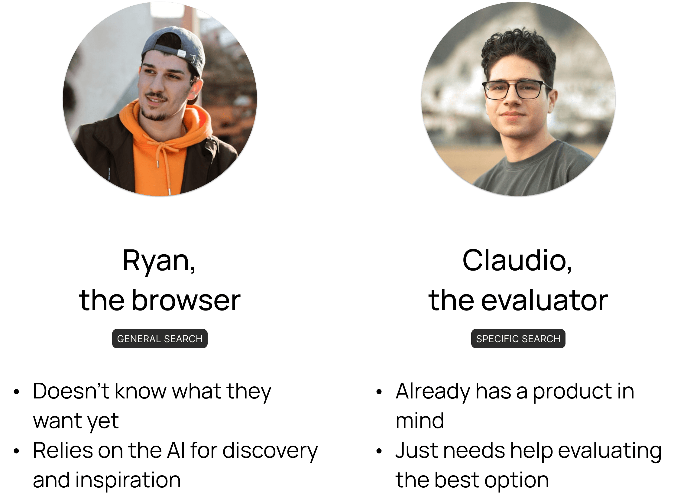
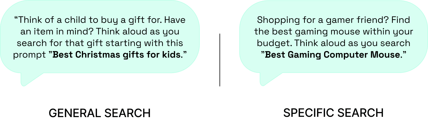
Each participant completed two tasks: a general and a specific search, while thinking out loud.
To put them in the right mindset, we provided the following scenarios:
We captured first impressions at the beginning, then compared them with post-task surveys and final interviews. That's how we tracked exactly where perception shifted and why the platform was losing people.
EXPERIMENTAL DESIGN
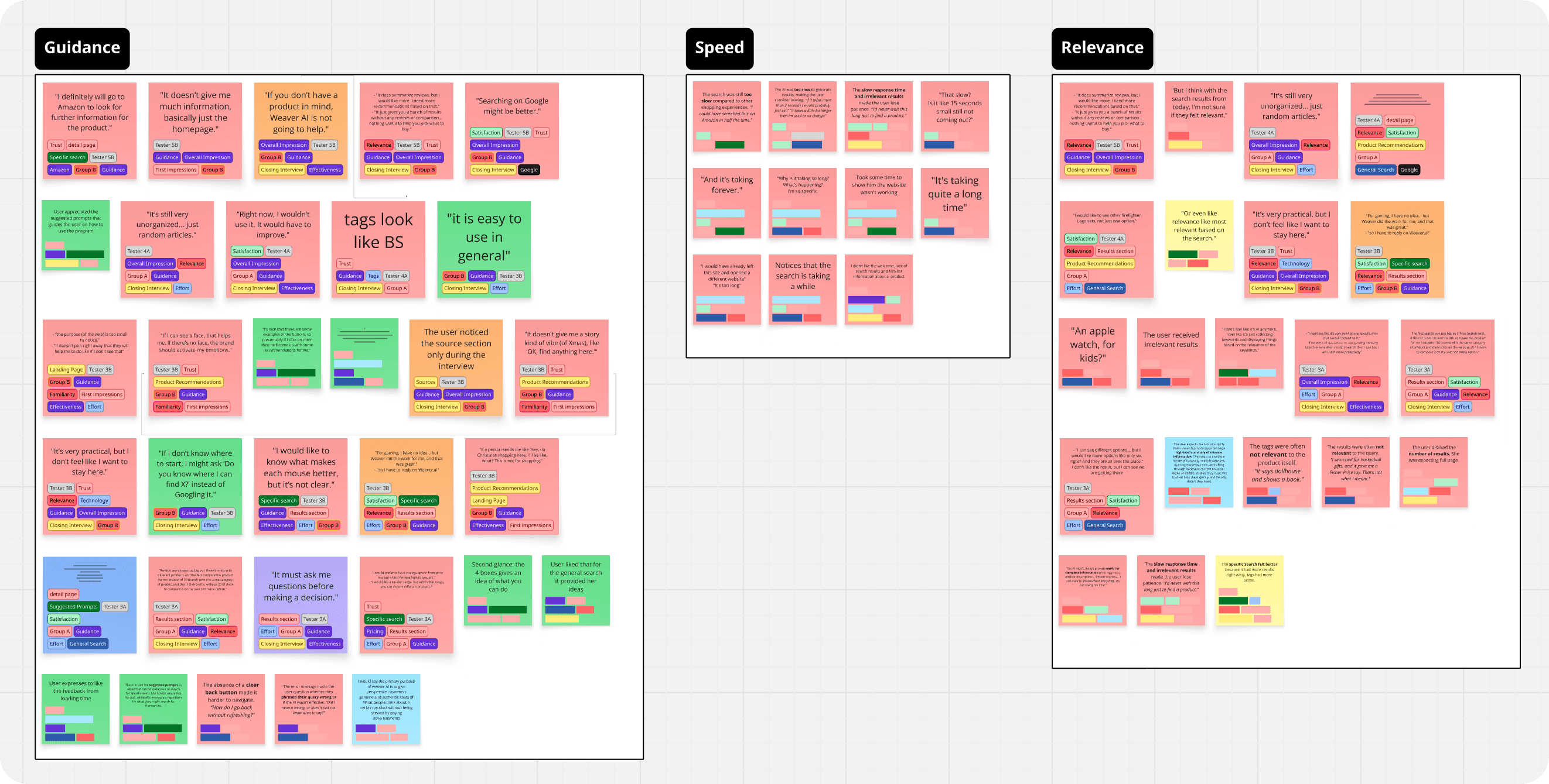
To make sense of all the think-aloud feedback and interview transcripts, I built an affinity diagram.
All sticky notes were coded after the sentiment of the comment and divided by task.
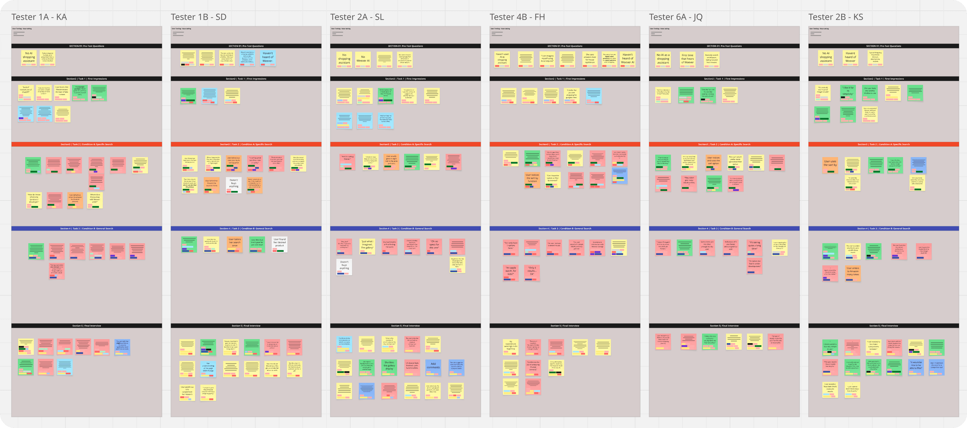
Then, I clustered recurring patterns and identified exactly where users were getting frustrated.
The study revealed users had slightly positive first impressions, describing Weever as modern and smart.
Most expected it to act as a product recommendation or review tool, building strong initial trust based on appearance and branding.
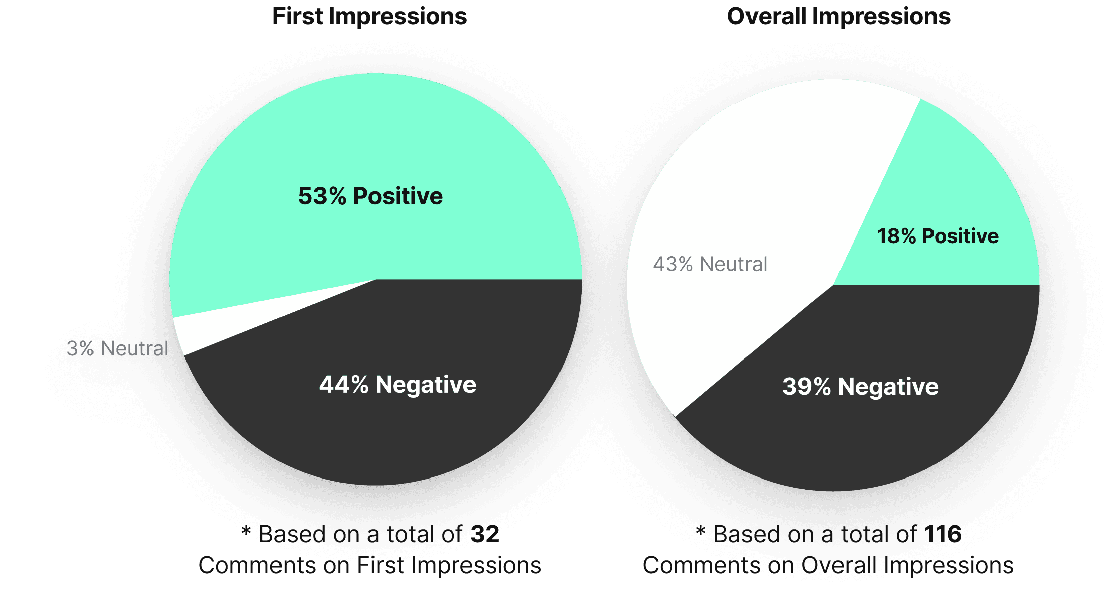
Users’ overall impressions declined notably after interacting with the platform.
Comments about irrelevant results, slow loading, and limited transparency kept coming up:
Our recommendations.
We ranked the most critical pain points from the study and paired each one with concrete design recommendations.
 Problem: Lack of transparency |  Solution: Add a 'Stream of Thought' component showing the AI's logic |
|---|---|
When users searched for inspiration, results had nothing to do with what they were actually looking for. | Showing users what the AI is actually doing, what it checked and why, makes the whole thing feel trustworthy. |
EXAMPLE CHATGPT'S STREAM OF THOUGHT
Problem: Slow loading times | Solution: Add a progress indicator or loading feedback to manage expectations |
|---|---|
Delays of 5+ seconds with no visual feedback. Users couldn't tell if the platform was loading or just broken, so they left. | It doesn't make the backend faster, but it makes the wait feel shorter by showing users that something is actually happening. |
EXAMPLE SKELETON LOADER

Problem: Irrelevant results | Solution: Add 'Follow Ups' before searching |
|---|---|
Users got 1-2 results with no relevance and nowhere to go from there. Not enough to compare, not enough to decide. Just a dead end. | The AI should ask a quick follow up question before searching. Something like "What's your budget?" or "What color are you looking for?" That's what makes it feel like an assistant, not just a search bar. |
EXAMPLE FOLLOW UPS
Our recommendations reduced the platform's bounce rate by 22%
Months after our research, the CEO reached out to share that implementing our findings had brought the bounce rate down from 18% to 14%. The four pain points we identified were the right ones to solve.
KEY TAKEAWAYS
 Transparency builds tolerance. |  Guidance beats guessing. |  Trust is fragile. |
|---|---|---|
Users didn't mind waiting as long as they could see something was happening. The problem was never the speed, it was not knowing if the platform was even working. | The AI kept trying to guess what users wanted instead of just asking. A simple follow up question would have changed everything. | One bad result was enough to lose the user. Explaining yourself and recovering from mistakes matters just as much as the algorithm itself. |
PICTURE OF THE TEAM WITH FRED, CEO OF WEEVER.AI
Weever AI is an AI shopping assistant that pulls real user reviews to give users unbiased product recommendations.
I was part of a three-person UX research team from HEC Montréal brought in to evaluate the platform and present findings directly to the CEO of Weever, Frédéric Marcoux.
Working directly with Fred, we ran usability tests and user interviews targeting young adults in major Canadian tech hubs. We mapped how people were actually using the platform, found the weak spots, and figured out how to turn browsers into buyers.
The core concept was strong, but the platform had an 18% bounce rate and users weren't converting.
Our research uncovered four core pain points:
Irrelevant search results 12/12 testers got recommendations that had nothing to do with what they searched for. | Slow loading times 12/12 users would rather leave than wait. The wait was long enough to lose everyone. |
No transparency 7/12 users lost trust because the AI never explained why it was recommending what it was. | Limited results 8/12 users expected more results when conducting a search. |
WEEVER AI SEARCH RESULTS
The goal was clear: figure out why people were dropping off and what was stopping them from actually buying.
To do so, we established three main objectives:
Goals |
|---|
|
|
|
To understand how users were experiencing the platform, we ran a usability study and conducted user interviews with 12 participants.
People shop in completely different ways. So, we had all our testers evaluate the platform through two different lenses:
Each participant completed two tasks: a general and a specific search, while thinking out loud.
To put them in the right mindset, we provided the following scenarios:
We captured first impressions at the beginning, then compared them with post-task surveys and final interviews. That's how we tracked exactly where perception shifted and why the platform was losing people.
EXPERIMENTAL DESIGN
To make sense of all the think-aloud feedback and interview transcripts, I built an affinity diagram.
All sticky notes were coded after the sentiment of the comment and divided by task.
Then, I clustered recurring patterns and identified exactly where users were getting frustrated.
The study revealed users had slightly positive first impressions, describing Weever as modern and smart.
Most expected it to act as a product recommendation or review tool, building strong initial trust based on appearance and branding.
Users’ overall impressions declined notably after interacting with the platform.
Comments about irrelevant results, slow loading, and limited transparency kept coming up:
Our recommendations.
We ranked the most critical pain points from the study and paired each one with concrete design recommendations.
Problem: Lack of transparency | Solution: Add a 'Stream of Thought' component showing the AI's logic |
|---|---|
When users searched for inspiration, results had nothing to do with what they were actually looking for. | Showing users what the AI is actually doing, what it checked and why, makes the whole thing feel trustworthy. |
EXAMPLE CHATGPT'S STREAM OF THOUGHT
Problem: Slow loading times | Solution: Add a progress indicator or loading feedback to manage expectations |
|---|---|
Delays of 5+ seconds with no visual feedback. Users couldn't tell if the platform was loading or just broken, so they left. | It doesn't make the backend faster, but it makes the wait feel shorter by showing users that something is actually happening. |
EXAMPLE SKELETON LOADER
Problem: Irrelevant results | Solution: Add 'Follow Ups' before searching |
|---|---|
Users got 1-2 results with no relevance and nowhere to go from there. Not enough to compare, not enough to decide. Just a dead end. | The AI should ask a quick follow up question before searching. Something like "What's your budget?" or "What color are you looking for?" That's what makes it feel like an assistant, not just a search bar. |
EXAMPLE FOLLOW UPS
Our recommendations reduced the platform's bounce rate by 22%
Months after our research, the CEO reached out to share that implementing our findings had brought the bounce rate down from 18% to 14%. The four pain points we identified were the right ones to solve.
KEY TAKEAWAYS
Transparency builds tolerance. | Guidance beats guessing. | Trust is fragile. |
|---|---|---|
Users didn't mind waiting as long as they could see something was happening. The problem was never the speed, it was not knowing if the platform was even working. | The AI kept trying to guess what users wanted instead of just asking. A simple follow up question would have changed everything. | One bad result was enough to lose the user. Explaining yourself and recovering from mistakes matters just as much as the algorithm itself. |
PICTURE OF THE TEAM WITH FRED, CEO OF WEEVER.AI
Other projects
Qamaq.io: Enterprise AI
Redesigning an Enterprise AI solution for every skill level

Scoutr.ca: Multi-Role SaaS
Designing a seamless platform for five different types of users

Fractal: Enterprise SaaS Platform
Building a design system and mobile experience for 60,000 employees
Copyright 2026 by Nicolas Peyre
Copyright 2026 by Nicolas Peyre
Copyright 2026 by Nicolas Peyre