Fractal: Enterprise SaaS Platform
Building a design system and mobile experience for 60,000 employees
Role
Lead UX Designer
Industry
SaaS HR
Duration
4 years

Fractal is an enterprise SaaS platform serving over 60,000 employees, designed to centralize HR workflows across Latin America.
When I joined Fractal, I was receiving 15 to 20 Slack requests a week from developers and PMs who needed individual screens just to move forward. I realized the real problem wasn't my workload, it was the absence of a shared design language. So I proposed building one.
Design lived in a fragmented Adobe XD environment with no component library, no documentation, and no single source of truth. I migrated all core workflows into Figma and built a centralized design system from scratch. This established UI consistency, accelerated developer handoff, reduced support tickets by 30%, and gave us the foundation to finally design the platform's responsive mobile experience.
 Challenges |  Goals |
|---|---|
|
|
Key Decision |
|---|
Although client demand for mobile was growing, I knew that building responsive screens on top of a broken foundation would only multiply the inconsistencies. The design system had to come first. |
FRACTAL'S OLD INTERFACE
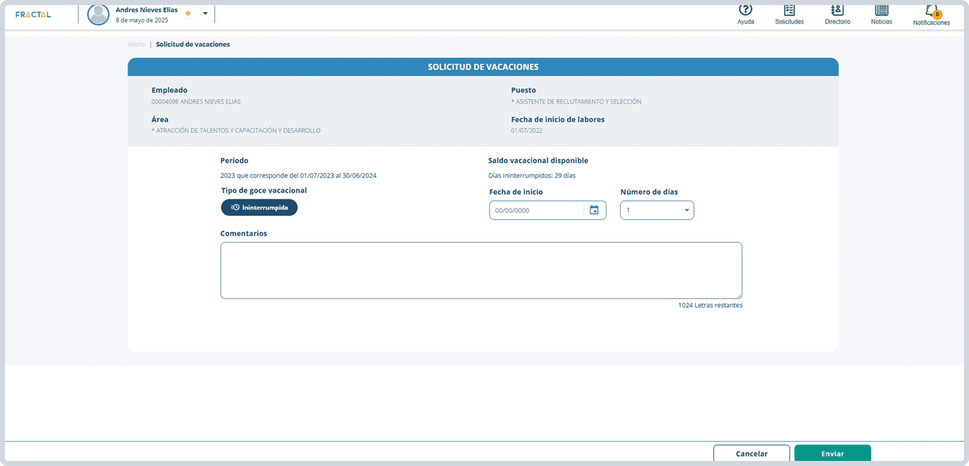
To address these challenges, I rebuilt the design system from scratch and redesigned the core platform experience in Figma.
Instead of migrating outdated screens from Adobe XD, I rebuilt everything from scratch. The component library covered color tokens, typography, interactive states, and full component specs, all documented in a single Figma file. Developers went from pinging me on Slack to self serving from the system.
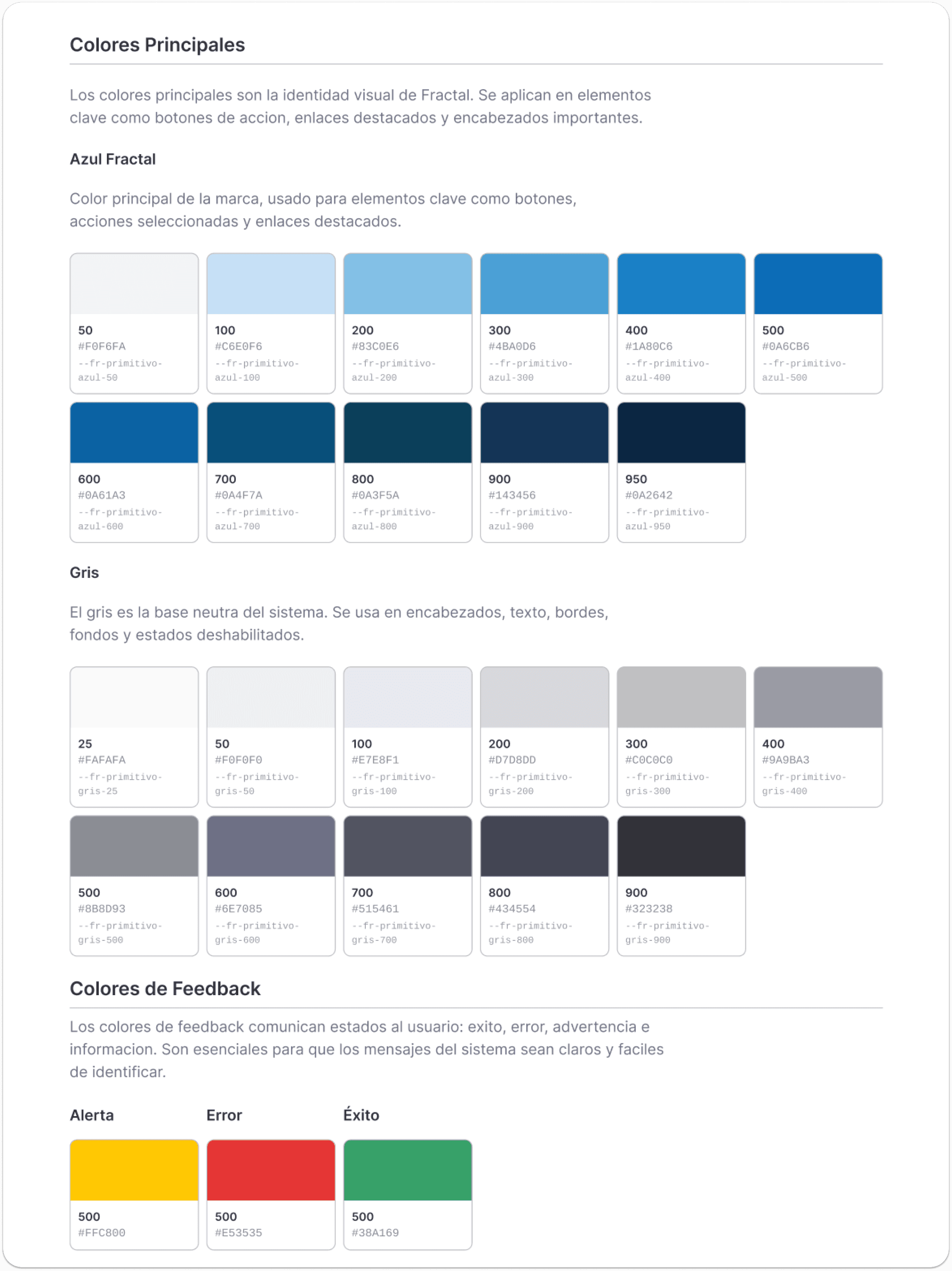
Colors
A structured color palette using Fractal's main color with clear usage rules so any developer could apply the right color without guessing.
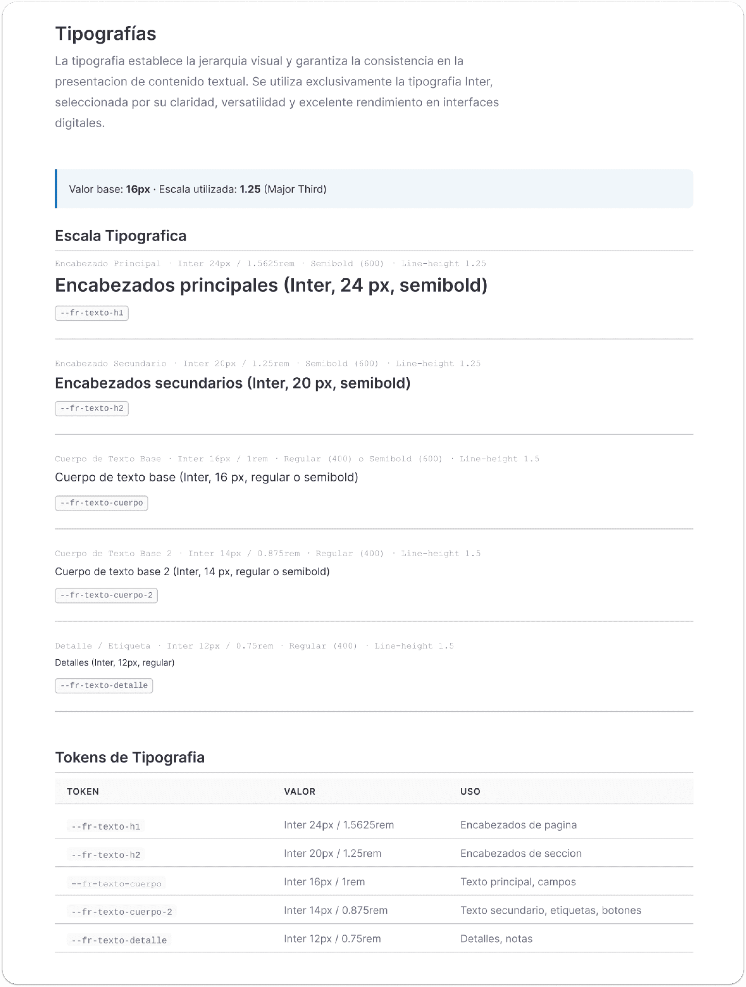
Typography
I replaced Open Sans with Inter for a more modern feel and built a type scale with named tokens aligned to how developers referenced styles in code.
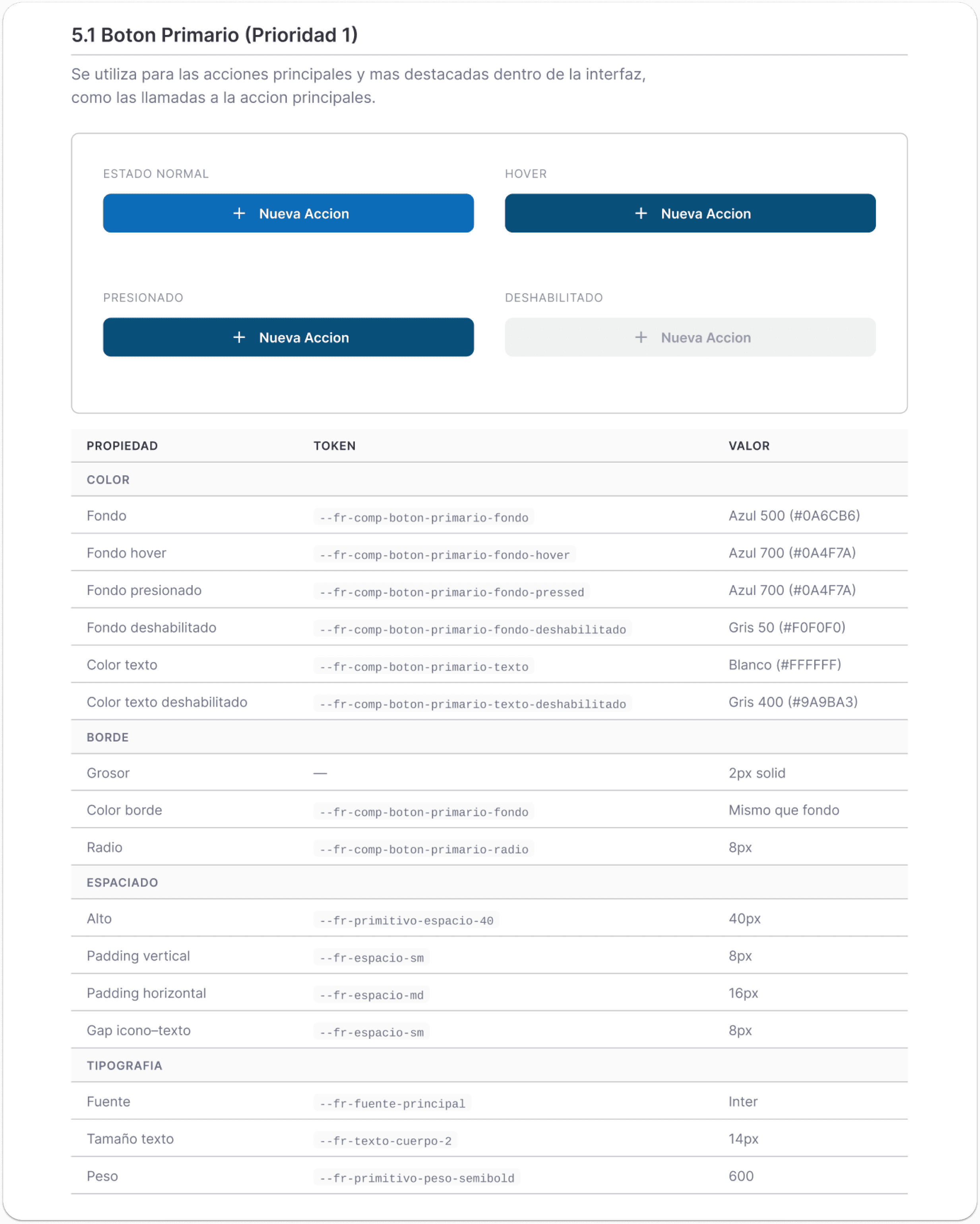
Buttons
Buttons were prioritized first because they appeared in every core flow. I documented all states and specs so nothing got lost in handoff.
Fields
Form fields were the second most repeated component. Every state was accounted for, from default to error, keeping the experience consistent across the platform.
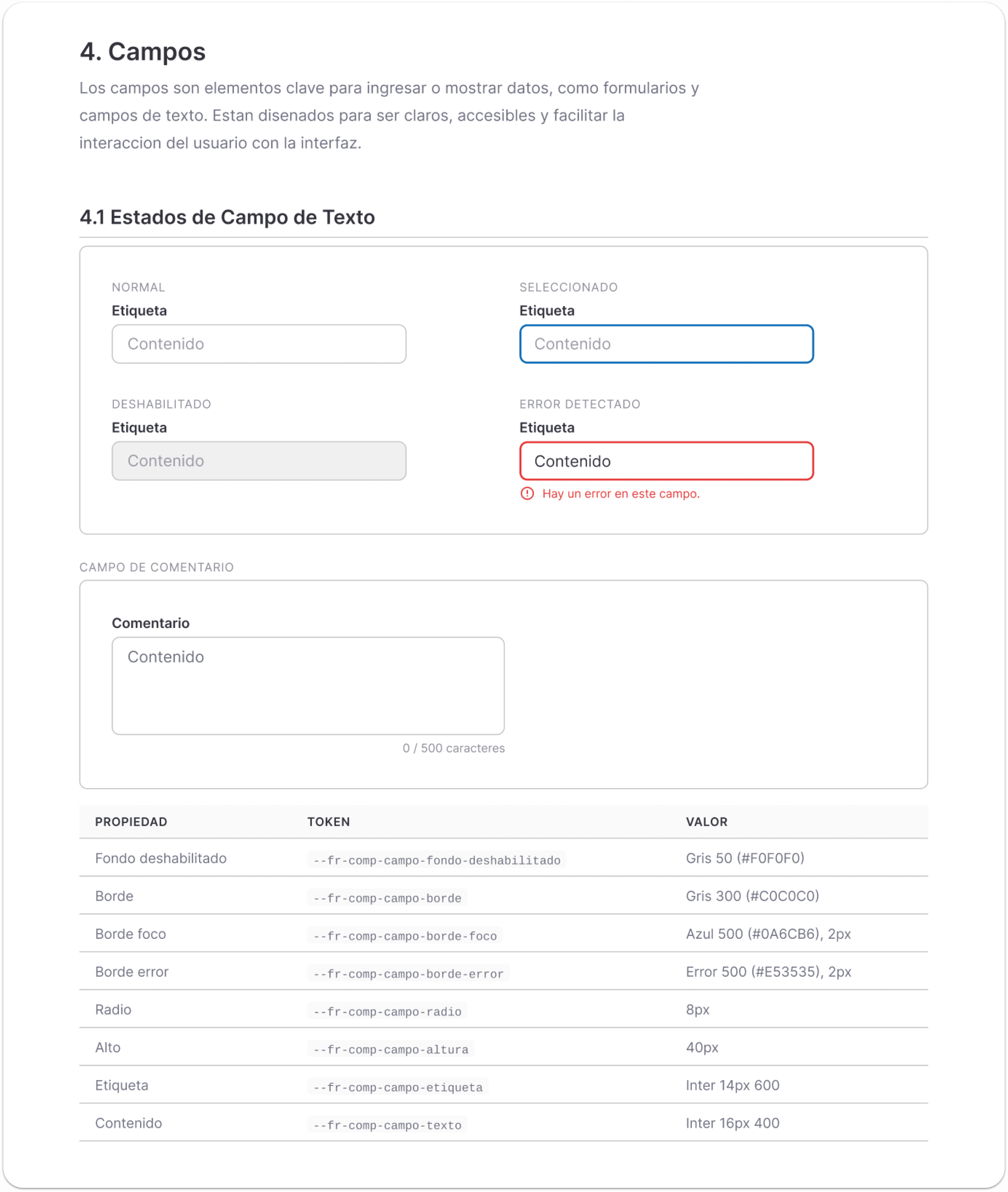
Showing 4 of 12 documented sections.The full system also covers iconography, spacing, navigation, modals, tables, and more.
With the design system in place, I designed Fractal's responsive mobile experience.
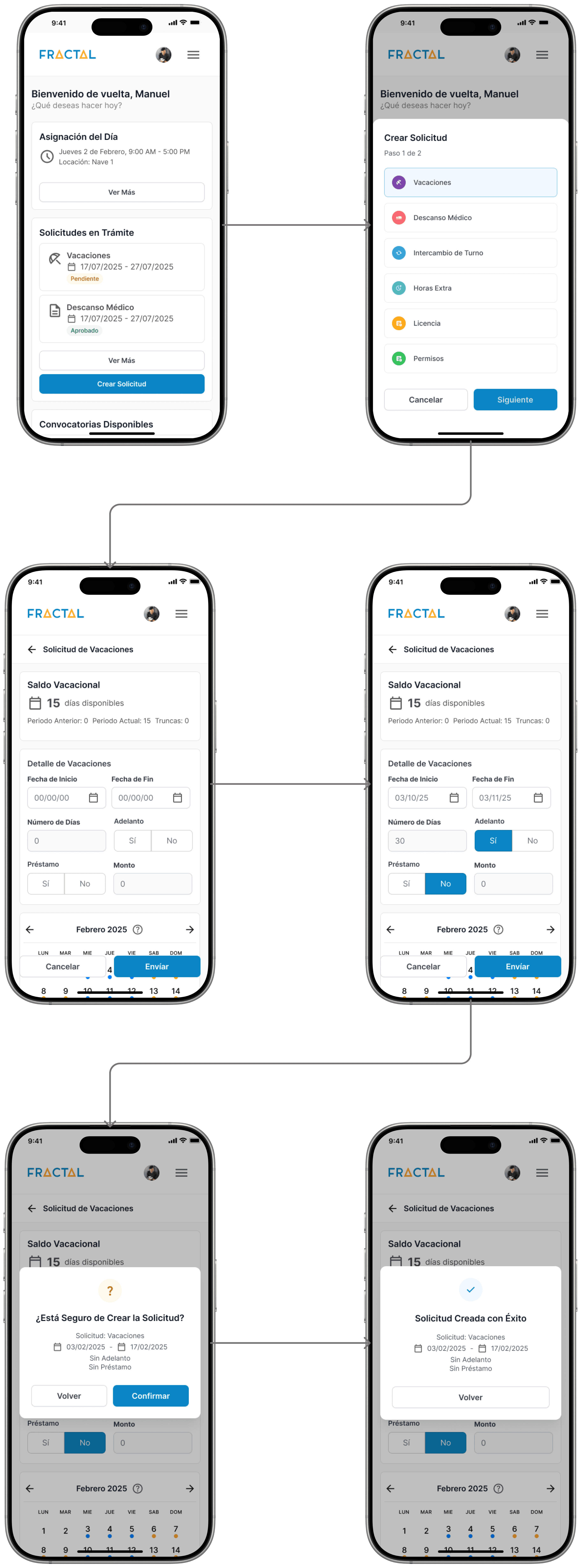
Request submissions was the most used flow and the biggest source of support tickets. The original desktop experience crammed everything into a single dense form that didn't translate to mobile. I designed the full mobile experience: a home screen, a bottom sheet consolidating all request types, and focused step by step flows for each one. The design system made this fast since every component was already built and documented.
The design system and mobile experience reduced support tickets by 30% and transformed the team's workflow.
After the design system launched, Slack requests for individual screens dropped to near zero. Developers could self serve from the Figma file without needing me. The mobile experience shipped to clients and the PM reported a 30% reduction in support tickets, directly tied to the redesigned request flows. What started as a broken handoff process became a scalable, self sustaining design workflow.
MY TAKEAWAYS
 Start with the system, not screens. |  As a solo designer, your job isn't just design. It's advocacy. |
|---|---|
Every design decision without a shared foundation multiplies rework for designers and developers. Building the design system first made every feature after it faster to design, build, and scale. | Changing an established handoff workflow that the team had relied on for years required building trust, explaining the benefits, and getting buy in before changing anything. |
Fractal is an enterprise SaaS platform serving over 60,000 employees, designed to centralize HR workflows across Latin America.
When I joined Fractal, I was receiving 15 to 20 Slack requests a week from developers and PMs who needed individual screens just to move forward. I realized the real problem wasn't my workload, it was the absence of a shared design language. So I proposed building one.
Design lived in a fragmented Adobe XD environment with no component library, no documentation, and no single source of truth. I migrated all core workflows into Figma and built a centralized design system from scratch. This established UI consistency, accelerated developer handoff, reduced support tickets by 30%, and gave us the foundation to finally design the platform's responsive mobile experience.
Challenges | Goals |
|---|---|
|
|
Key Decision |
|---|
Although client demand for mobile was growing, I knew that building responsive screens on top of a broken foundation would only multiply the inconsistencies. The design system had to come first. |
FRACTAL'S OLD INTERFACE
To address these challenges, I rebuilt the design system from scratch and redesigned the core platform experience in Figma.
Instead of migrating outdated screens from Adobe XD, I rebuilt everything from scratch. The component library covered color tokens, typography, interactive states, and full component specs, all documented in a single Figma file. Developers went from pinging me on Slack to self serving from the system.
Colors
A structured color palette using Fractal's main color with clear usage rules so any developer could apply the right color without guessing.
Typography
I replaced Open Sans with Inter for a more modern feel and built a type scale with named tokens aligned to how developers referenced styles in code.
Buttons
Buttons were prioritized first because they appeared in every core flow. I documented all states and specs so nothing got lost in handoff.
Fields
Form fields were the second most repeated component. Every state was accounted for, from default to error, keeping the experience consistent across the platform.
Showing 4 of 12 documented sections.The full system also covers iconography, spacing, navigation, modals, tables, and more.
With the design system in place, I designed Fractal's responsive mobile experience.
Request submissions was the most used flow and the biggest source of support tickets. The original desktop experience crammed everything into a single dense form that didn't translate to mobile. I designed the full mobile experience: a home screen, a bottom sheet consolidating all request types, and focused step by step flows for each one. The design system made this fast since every component was already built and documented.
The design system and mobile experience reduced support tickets by 30% and transformed the team's workflow.
After the design system launched, Slack requests for individual screens dropped to near zero. Developers could self serve from the Figma file without needing me. The mobile experience shipped to clients and the PM reported a 30% reduction in support tickets, directly tied to the redesigned request flows. What started as a broken handoff process became a scalable, self sustaining design workflow.
MY TAKEAWAYS
Start with the system, not screens. | As a solo designer, your job isn't just design. It's advocacy. |
|---|---|
Every design decision without a shared foundation multiplies rework for designers and developers. Building the design system first made every feature after it faster to design, build, and scale. | Changing an established handoff workflow that the team had relied on for years required building trust, explaining the benefits, and getting buy in before changing anything. |
Other projects
Qamaq.io: Enterprise AI
Redesigning an Enterprise AI solution for every skill level

Scoutr.ca: Multi-Role SaaS
Designing a seamless platform for five different types of users

Weever.ai: AI Shopping Assistant
Uncovering what makes users trust in an AI Shopping Assistant
Copyright 2026 by Nicolas Peyre
Copyright 2026 by Nicolas Peyre
Copyright 2026 by Nicolas Peyre