Scoutr.ca: Multi-Role SaaS
Designing a seamless platform for five different types of users in a short time frame
Role
UX Architect
Industry
SaaS
Duration
3 months

Location scouting is a mess. Scouts spend hours gathering references, organizing, and piecing them together into a deck for clients.
Scoutr, a Toronto-based startup, wanted to fix that. The goal was to build a centralized app where scouts could instantly compile, manage, and present location options in a clean, professional format.
I was brought in as the sole UX designer to build the platform architecture from scratch. My job was to map the user flows, get stakeholder buy-in, design the wireframes and build a design system that our partner UI agency could stylize.
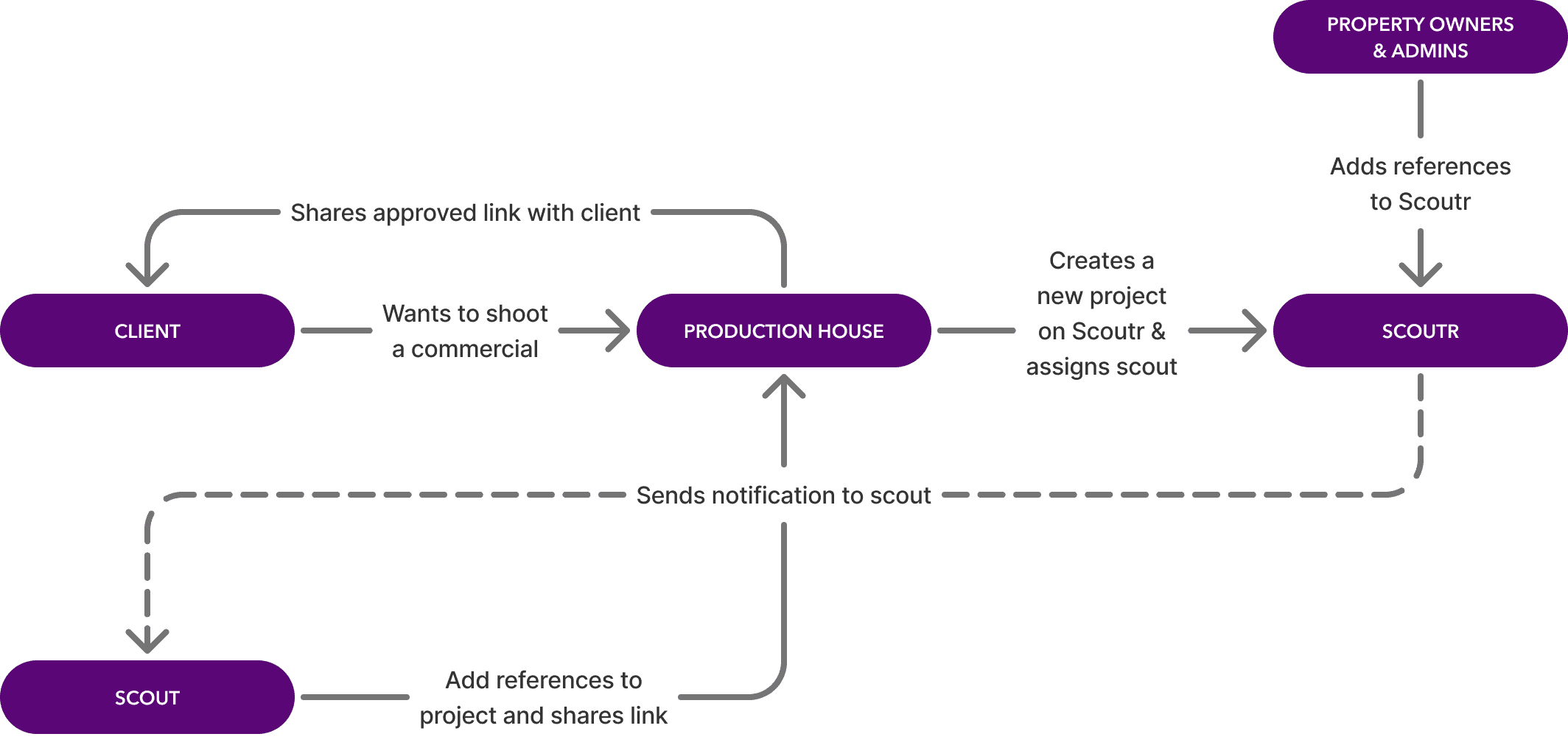
The challenge was untangling five different roles into the same platform.
Five completely different roles, the Scout, the Client, the Production House, the Property Owner, and the Admin, all had to work together in one platform. So, I initially diagramed this high-level flowchart to validate the platform's architecture before moving into the user flows per role.
HIGH-LEVEL ECOSYSTEM FLOWCHART
Once the big picture was confirmed, I broke it down role by role.
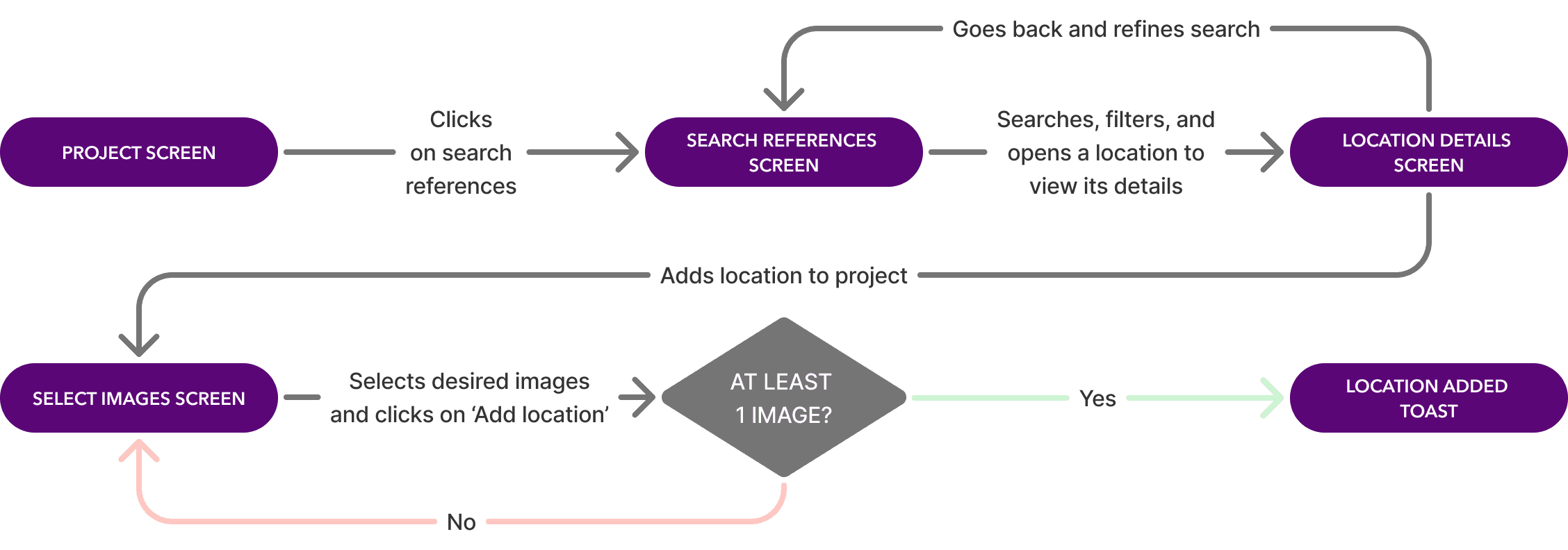
For each of the five roles, I mapped out every step, every decision point, and considered edge cases.
EXAMPLE 'SEARCH AND ADD REFERENCES' FLOW
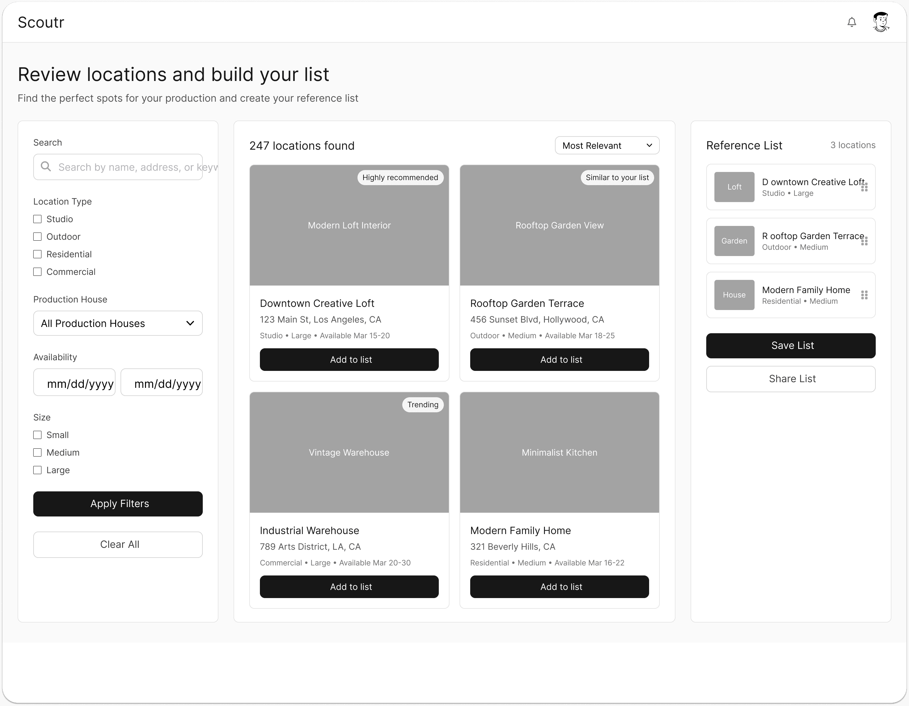
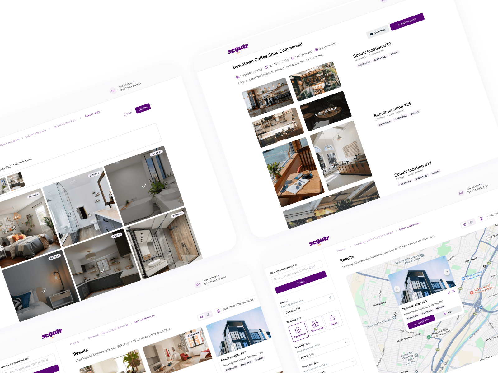
To validate the vision with stakeholders fast, I needed to go from flows to screens without starting from zero.
I used ChatGPT to write structural prompts and fed them into UX Pilot to generate base wireframes. That gave me a strong head start on the layout. I then went into Figma and refined everything manually to make sure the UX logic actually matched the approved flows.
UX PILOT EXAMPLE OUTPUT
REFINED WIREFRAME BY ME
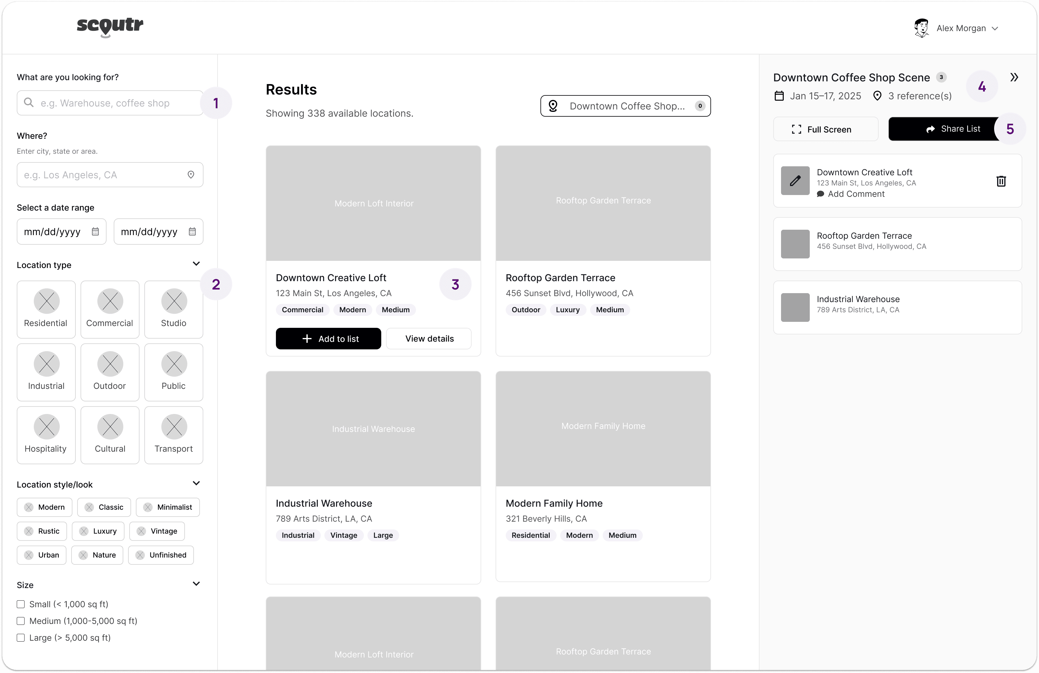
Conversational microcopy. Replaced rigid filter labels with natural, conversational prompts that actually guide the user.
Visual filter chips. Swapped standard checkboxes for icon chips that are easier to scan and faster to tap.
Contextual hover states. Action buttons only appear on hover, keeping the cards clean by default while giving developers clear interaction states to work with.
Dynamic project name. Replaced the generic "Reference List" header with the actual project name so users always know where they are.
Better hierarchy. Moved primary actions to follow a more natural reading pattern so the most important interactions are the first thing you see.
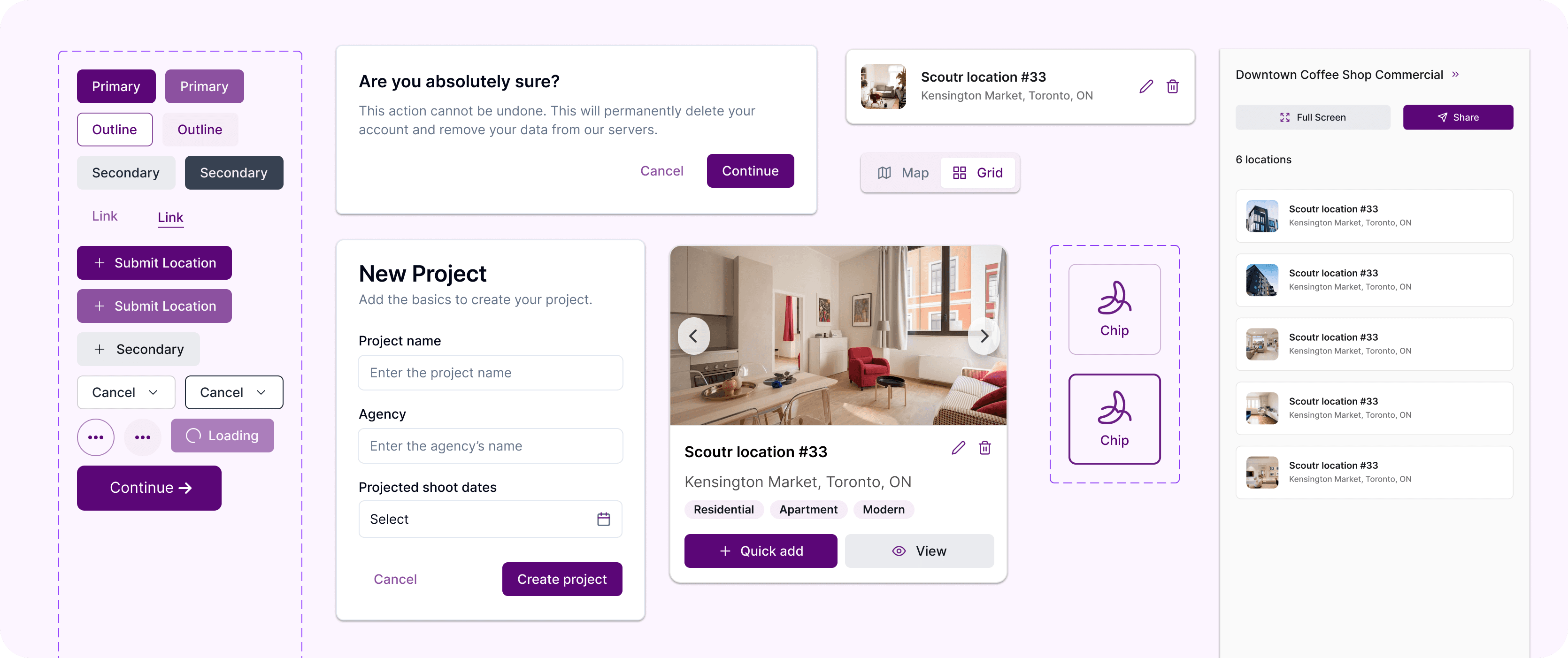
With the wireframes approved, the final step was preparing the project for our visual design partner.
Instead of just dropping a massive file of flat screens, I built a design system. I defined the structure, auto-layout, and interaction states in Figma so the partner agency had a clear blueprint to work from.
Because the UX architecture was already locked in, they could apply Scoutr's branding and styling on top without having to guess or rebuild anything from scratch.
SNEAK PEEK OF SCOUTR'S DESIGN SYSTEM
My takeaway: AI speeds up the process, but the thinking behind it is still entirely human.
Using UX Pilot and ChatGPT to skip the blank canvas phase was a game changer. In minutes I had a structural foundation to work from instead of starting from zero.
But the raw output is just a starting point. It still takes a human eye to refine the microcopy, fix the hierarchy, and make sure every interaction actually lines up with the needs of the user.
My AI Stack
How I collaborated with AI for this project:
Location scouting is a mess. Scouts spend hours gathering references, organizing, and piecing them together into a deck for clients.
Scoutr, a Toronto-based startup, wanted to fix that. The goal was to build a centralized app where scouts could instantly compile, manage, and present location options in a clean, professional format.
I was brought in as the sole UX designer to build the platform architecture from scratch. My job was to map the user flows, get stakeholder buy-in, design the wireframes and build a design system that our partner UI agency could stylize.
The challenge was untangling five different roles into the same platform.
Five completely different roles, the Scout, the Client, the Production House, the Property Owner, and the Admin, all had to work together in one platform. So, I initially diagramed this high-level flowchart to validate the platform's architecture before moving into the user flows per role.
HIGH-LEVEL ECOSYSTEM FLOWCHART
Once the big picture was confirmed, I broke it down role by role.
For each of the five roles, I mapped out every step, every decision point, and considered edge cases.
EXAMPLE 'SEARCH AND ADD REFERENCES' FLOW
To validate the vision with stakeholders fast, I needed to go from flows to screens without starting from zero.
I used ChatGPT to write structural prompts and fed them into UX Pilot to generate base wireframes. That gave me a strong head start on the layout. I then went into Figma and refined everything manually to make sure the UX logic actually matched the approved flows.
UX PILOT EXAMPLE OUTPUT
REFINED WIREFRAME BY ME
Conversational microcopy. Replaced rigid filter labels with natural, conversational prompts that actually guide the user.
Visual filter chips. Swapped standard checkboxes for icon chips that are easier to scan and faster to tap.
Contextual hover states. Action buttons only appear on hover, keeping the cards clean by default while giving developers clear interaction states to work with.
Dynamic project name. Replaced the generic "Reference List" header with the actual project name so users always know where they are.
Better hierarchy. Moved primary actions to follow a more natural reading pattern so the most important interactions are the first thing you see.
With the wireframes approved, the final step was preparing the project for our visual design partner.
Instead of just dropping a massive file of flat screens, I built a design system. I defined the structure, auto-layout, and interaction states in Figma so the partner agency had a clear blueprint to work from.
Because the UX architecture was already locked in, they could apply Scoutr's branding and styling on top without having to guess or rebuild anything from scratch.
SNEAK PEEK OF SCOUTR'S DESIGN SYSTEM
My takeaway: AI speeds up the process, but the thinking behind it is still entirely human.
Using UX Pilot and ChatGPT to skip the blank canvas phase was a game changer. In minutes I had a structural foundation to work from instead of starting from zero.
But the raw output is just a starting point. It still takes a human eye to refine the microcopy, fix the hierarchy, and make sure every interaction actually lines up with the needs of the user.
My AI Stack
How I collaborated with AI for this project:
Other projects
Qamaq.io: Enterprise AI
Redesigning an Enterprise AI solution for every skill level

Weever.ai: AI Shopping Assistant
Uncovering what makes users trust in an AI Shopping Assistant
Copyright 2026 by Nicolas Peyre
Copyright 2026 by Nicolas Peyre
Copyright 2026 by Nicolas Peyre