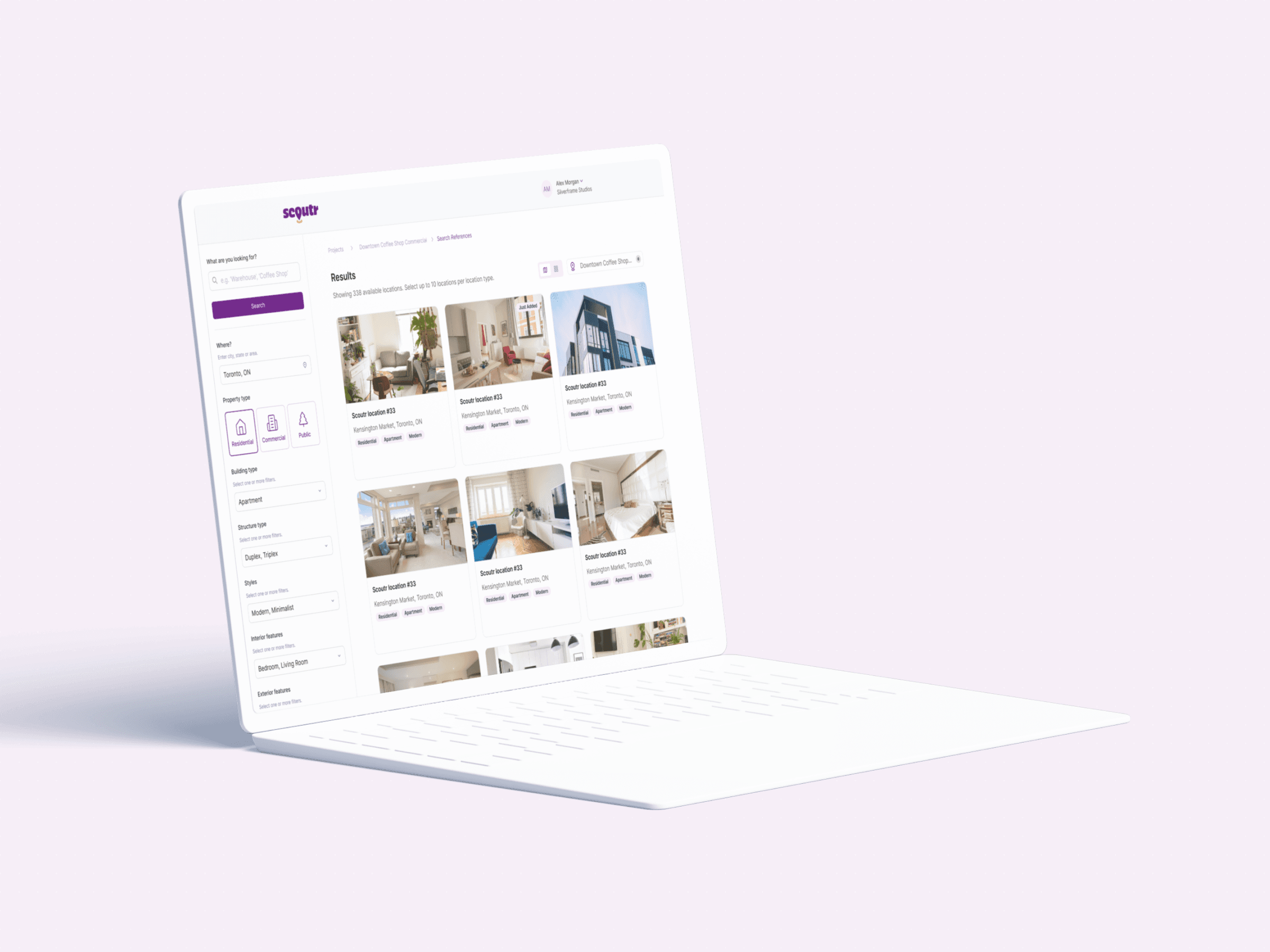
Brought in as the sole Product Designer to build Scoutr's platform architecture from scratch for a Toronto-based location-scouting startup.
Five distinct user roles (Scout, Client, Production House, Property Owner, Admin) needed to operate within a single, coherent platform.
Mapped a high-level ecosystem flowchart, validated it with stakeholders, then built role-by-role flows, wireframes, and a design system.
All five roles now navigate the same platform without confusion, each seeing only what's relevant to them.
Overview
One platform, five roles.
Location scouting is a mess. Scouts spend hours gathering references, organizing, and piecing them together into a deck for clients.
Scoutr, a Toronto-based startup, wanted to fix that. The goal was to build a centralized app where scouts could instantly compile, manage, and present location options in a clean, professional format.
I was brought in as the sole Product Designer to build the platform architecture from scratch. My job was to map the user flows, get stakeholder buy-in, design the wireframes, and build a design system that our partner UI agency could stylize.
Architecture & user flows
Mapping the ecosystem before touching a single screen.
Five completely different roles had to work together in one platform. Before designing anything, I needed to see how they all connected.
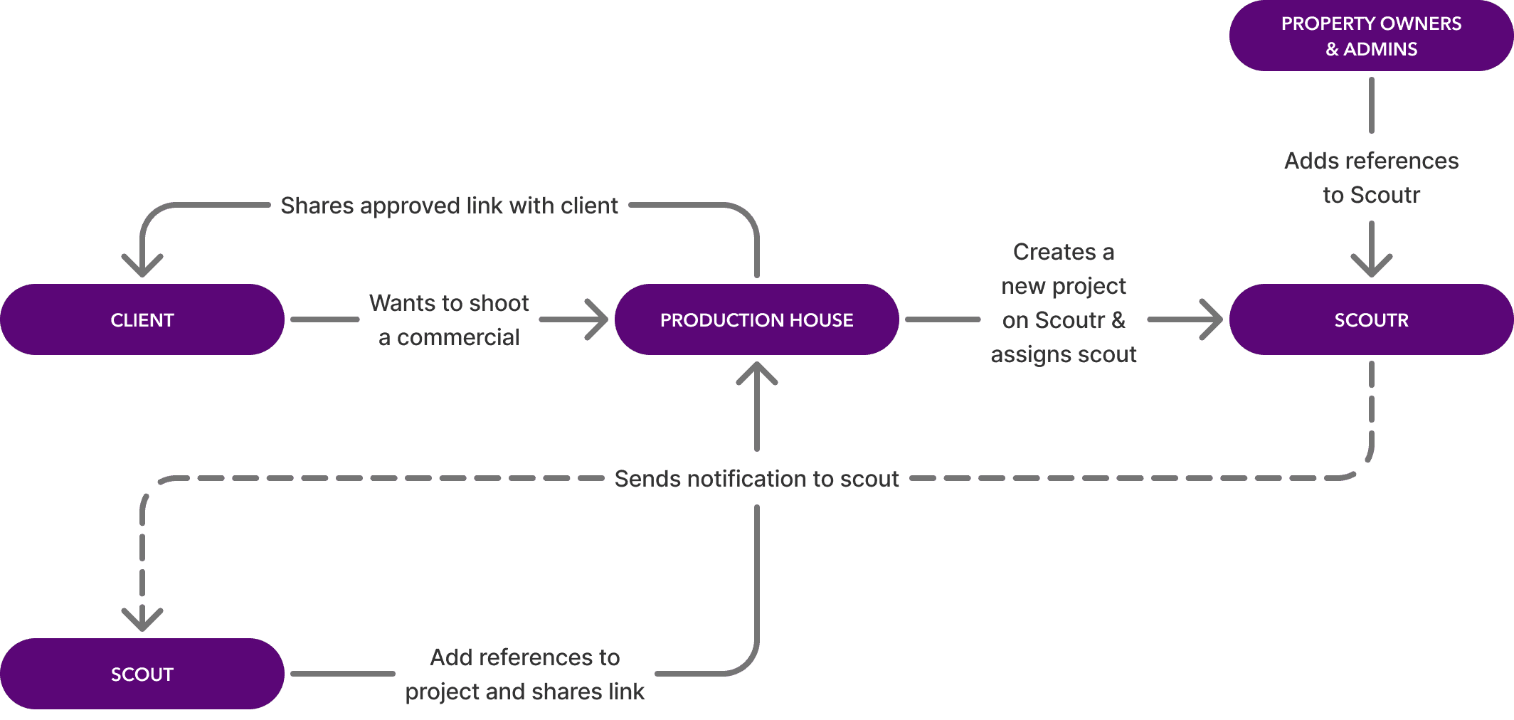
High-level ecosystem flowchart
Before touching any screens, I mapped the entire ecosystem, how all five roles connect, hand off work, and interact within the platform, and validated this architecture with stakeholders before moving into the user flows per role.
Role-by-role flow mapping
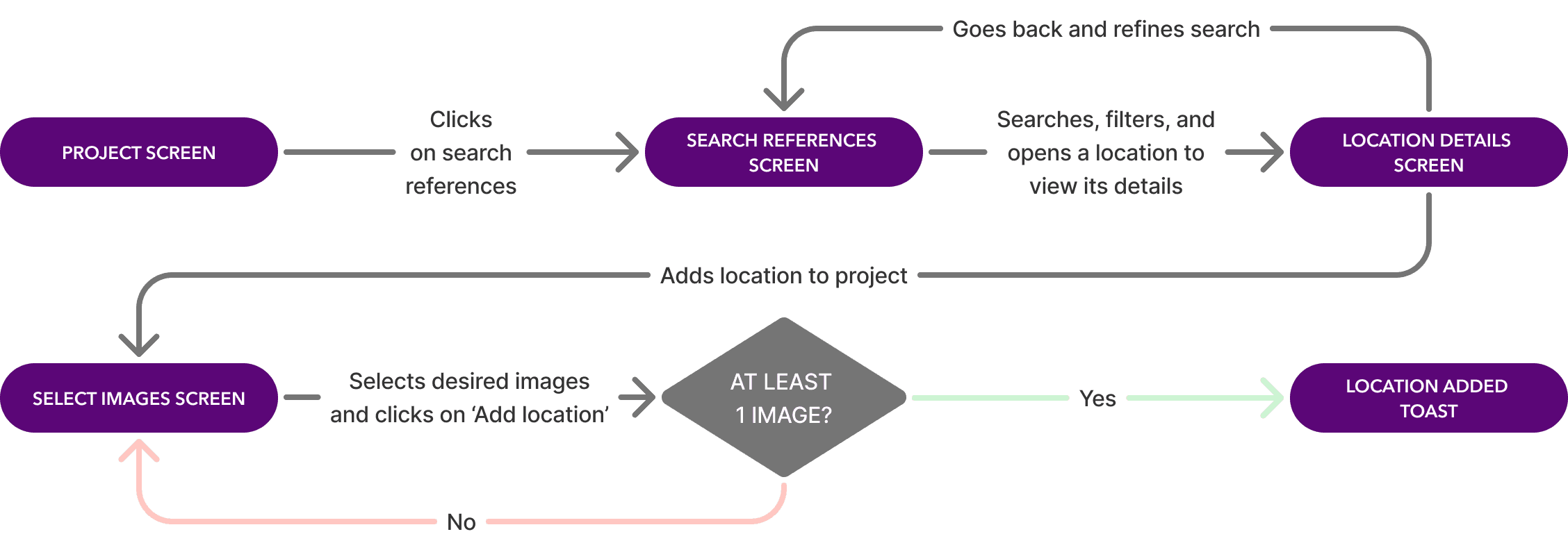
Once the big picture was confirmed, I broke it down role by role. For each of the five roles, I mapped out every step, every decision point, and considered edge cases. Below is the Scout's flow for searching and adding references to a project.
From flows to wireframes
AI-assisted wireframes, refined by hand.
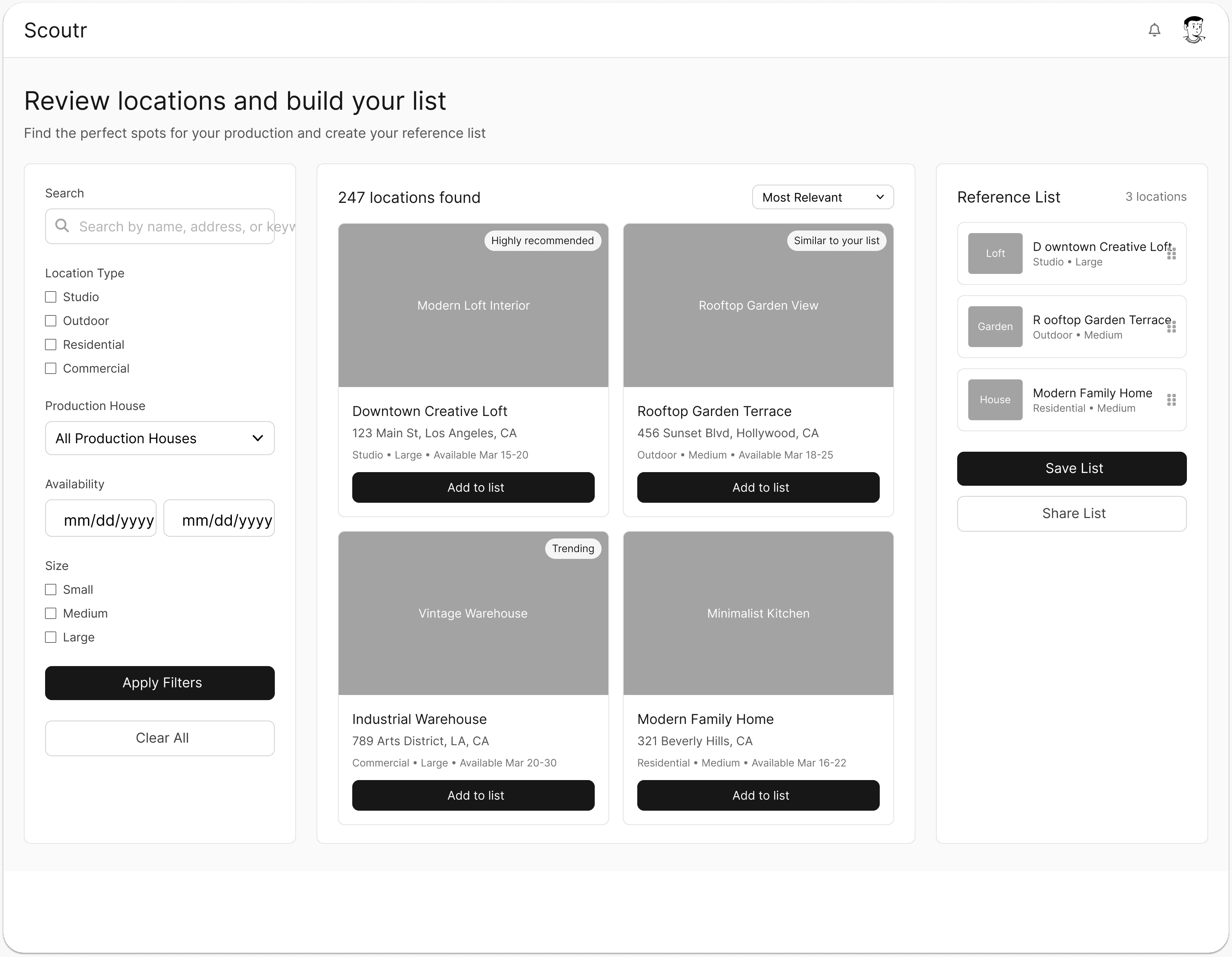
To validate the vision with stakeholders fast, I needed to go from flows to screens without starting from zero. I used ChatGPT to write detailed prompts and fed them into UX Pilot to generate base wireframes.
That gave me a strong head start on the layout. I then went into Figma and refined everything manually to make sure the UX logic actually matched the approved flows.
Before and after refinement
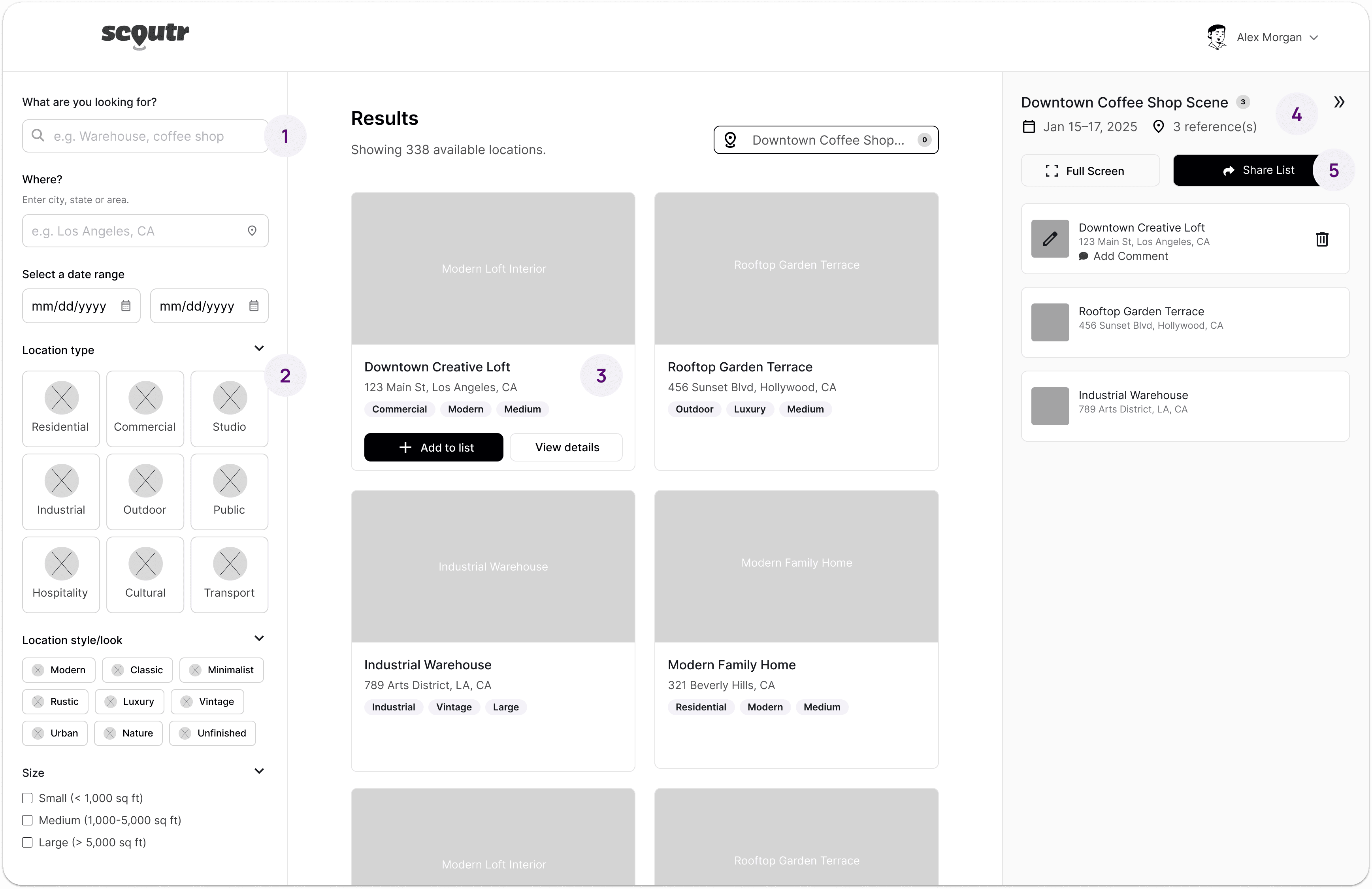
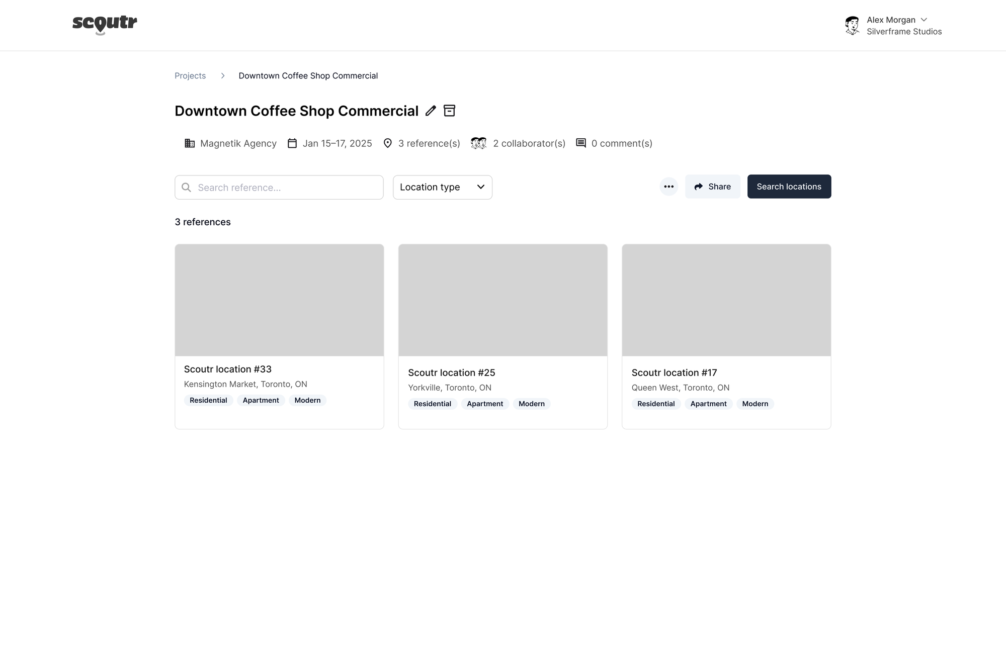
Refinements made to the AI-generated wireframes
Conversational microcopy. Replaced rigid filter labels with natural, conversational prompts that actually guide the user.
Visual filter chips. Swapped standard checkboxes for icon chips that are easier to scan and faster to tap.
Hover-only actions. Action buttons only appear on hover, keeping the cards clean by default while giving developers clear interaction states to work with.
Dynamic project name. Replaced the generic "Reference List" header with the actual project name so users always know where they are.
Better hierarchy. Moved primary actions to follow a more natural reading pattern so the most important interactions are the first thing you see.
Key decision. The founder wanted to organize locations into folders by type. I pushed back. Folders would force users to navigate in and out of categories just to browse, adding unnecessary clicks to every search. Filters solve the same problem in one view, letting users combine criteria without the back-and-forth.
Design system
Preparing the blueprint for our visual partner.
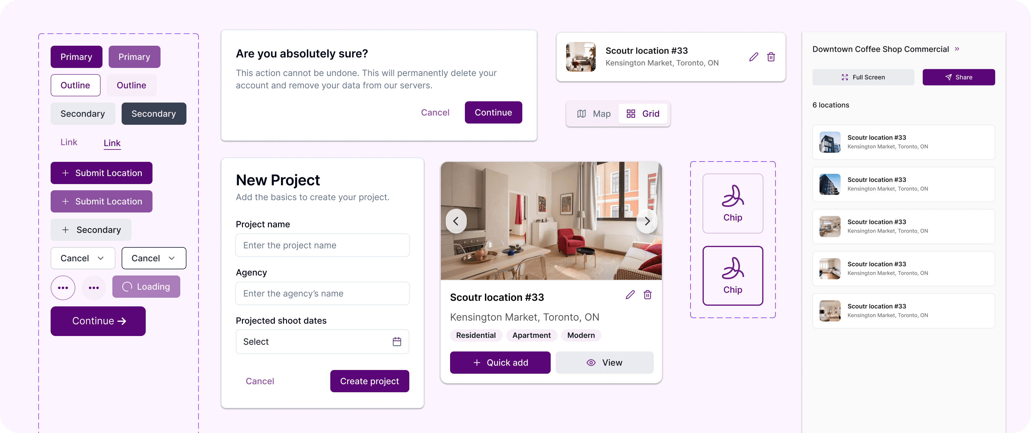
With the wireframes approved, the final step was preparing the project for our visual design partner. Instead of just dropping a massive file of flat screens, I built a design system.
I defined the structure, auto-layout, and interaction states in Figma so the partner agency had a clear blueprint to work from. Because the UX architecture was already locked in, they could apply Scoutr's branding and styling on top without having to guess or rebuild anything from scratch.
Results
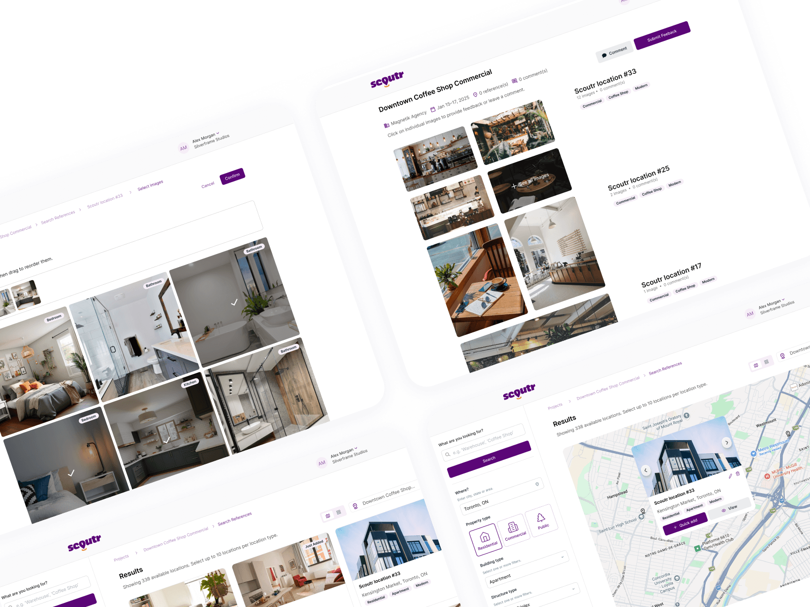
One ecosystem, five roles, zero confusion.
Previously, there was no unified platform for location scouting. Scouts, clients, production houses, property owners, and admins all relied on fragmented tools and manual handoffs.
The architecture now gives each role a tailored experience within one system, eliminating the back-and-forth that slowed every project down.
5
Distinct user roles (Scout, Client, Production House, Property Owner, and Admin) now navigate one seamless platform, each seeing only what's relevant to them.
2 months
From initial concept to a working MVP in just two months.
Key takeaways
What this taught me.
Architecture before screens
Mapping five roles into one ecosystem before touching wireframes kept the platform from becoming five disconnected products.
Design systems are handoff insurance
A structured component library meant the visual design partner could apply branding without rebuilding or misinterpreting the UX.