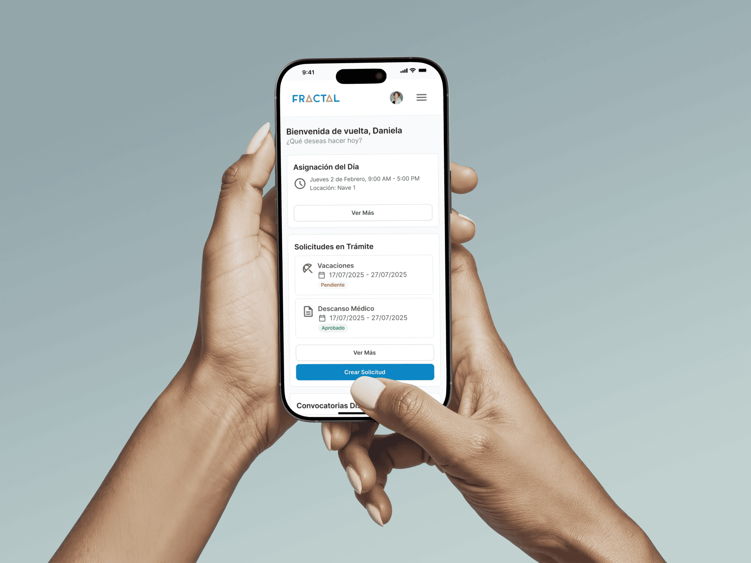
I joined Fractal, an HR platform used by more than 60,000 employees, as Product Designer. At the time, there was no clear design process and nothing was documented.
Without a design system, I was getting constant Slack requests for single screens, the UI looked different everywhere, and users kept complaining.
I built a design system in Figma from scratch, then used it to redesign the platform's most-used flows.
Support tickets went down 30%, and developers started using the design system on their own instead of messaging me.
Overview
One design system to build every screen.
Fractal is an HR platform used by more than 60,000 employees across Latin America. It brings all their HR tasks into one place.
When I joined, developers and PMs were sending me 15 to 20 Slack messages a week asking for single screens so they could keep working. I realized the problem wasn't how much work I had, it was that we didn't have a shared way of designing. So I proposed building one.
All the designs were spread across Adobe XD files, with no components, no documentation, and no single source of truth. I moved the main flows into Figma and built a design system from scratch.
The challenges
A messy process that kept getting worse.
You could see it everywhere, from screens that didn't match to a hand-off process that depended entirely on me. Three problems kept coming up.
My approach
Build the foundation, then build on it.
All three problems came from the same place: there was no shared base to design from. So instead of fixing screens one by one, I started there. Three things had to happen.
Key decision. The product manager was asking more and more for a redesign, but I knew that designing new screens without a solid base would only create more inconsistencies. The design system had to come first.
Design system
One Figma file, twelve documented sections.
Instead of moving the old screens over from Adobe XD, I rebuilt everything from scratch. The library included colors, typography, states like hover and error, and detailed specs for every component, all in one Figma file. Developers went from messaging me on Slack to finding what they needed on their own.
Teal is used for main actions and blue for secondary actions and links. Each color has simple rules, so any developer can pick the right one without guessing.
Primary · Teal
Teal 50
#E4F4F1
Teal 500
#009687
Teal 600
#008175
Teal 700
#006A60
Neutrals
Gray 50
#F5F7FA
Gray 200
#DDE3EA
Gray 400
#A6B3C0
Gray 500
#7E8EA0
Secondary · Blue
Blue 50
#EAF3FA
Blue 500
#2F85BE
Blue 700
#205D87
Ink 900
#0E3554
Feedback
Warning
#FFB92D
Error
#D63B3B
Success
#2F9E69
The font is Open Sans, with a set of sizes that match how developers were already using text styles in code.
Four button types cover every case, so developers use the right one instead of making up a new style.
Primary. The one main action on a screen, like submitting a request.
Outline. Secondary actions that sit next to a primary button.
Ghost. Smaller actions inside busy areas, like tables.
Destructive. Actions that reject or remove something, like denying a request.
Every field state is covered, from default to error, so forms look and work the same across the platform.
Default
Focus
Error
Selecciona una fecha de inicio para continuar.
Disabled
The redesign
From confusing forms to clear, step-by-step flows.
With the design system ready, I redesigned Fractal's most-used flows, both the screens employees use and the admin tools used to approve their requests. Requests were the biggest source of support tickets: people couldn't easily see how many vacation days they had left, and some terms were never explained.
Before redesigning anything, I ran a heuristic evaluation of the old screens using Nielsen's usability heuristics to find exactly where people were getting stuck. Consistency and standards guided the whole redesign, so every flow uses the same components and patterns from the design system.
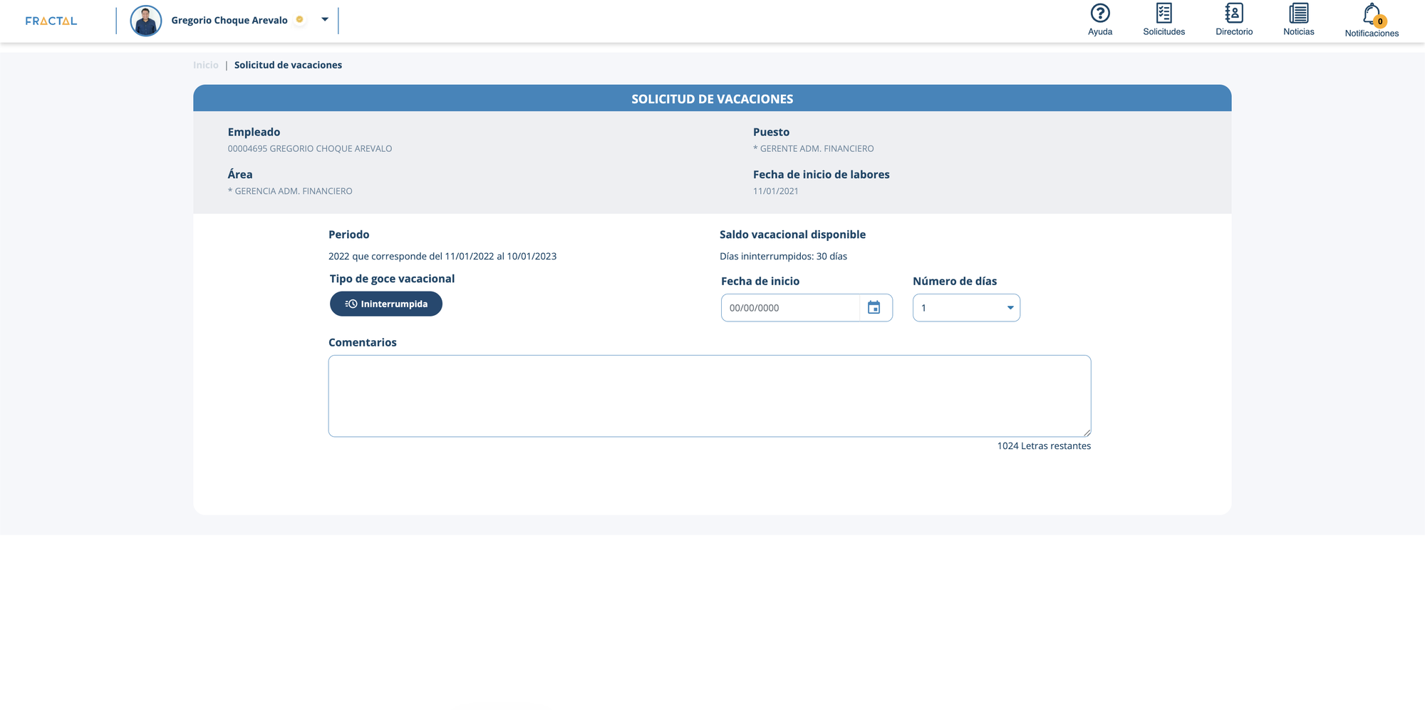
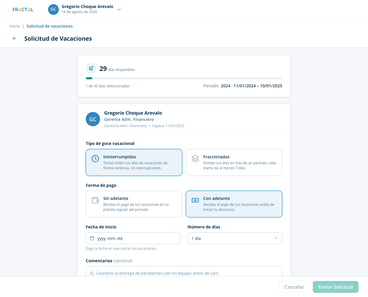
* Showing the vacation request flow here since it's one of the most popular, but this same approach was applied across many more flows.
Applied hierarchy. Before, everything sat at the same level, balance, type, payment, dates, with no order to follow. Now it's step by step: balance first, then your choices, then dates.
A balance that updates as you go. The old form showed your balance as plain text, so it was easy to miss. Now a progress bar changes as you pick your days, so you know how many you'll have left before you submit.
Explained confusing terms. A lot of people didn't know what "tipo de goce vacacional" or "forma de pago" meant. Now both are radiocards with a short description under each option, so you're not guessing.
I did the same on the admin side, where managers approve or reject every request that comes in.
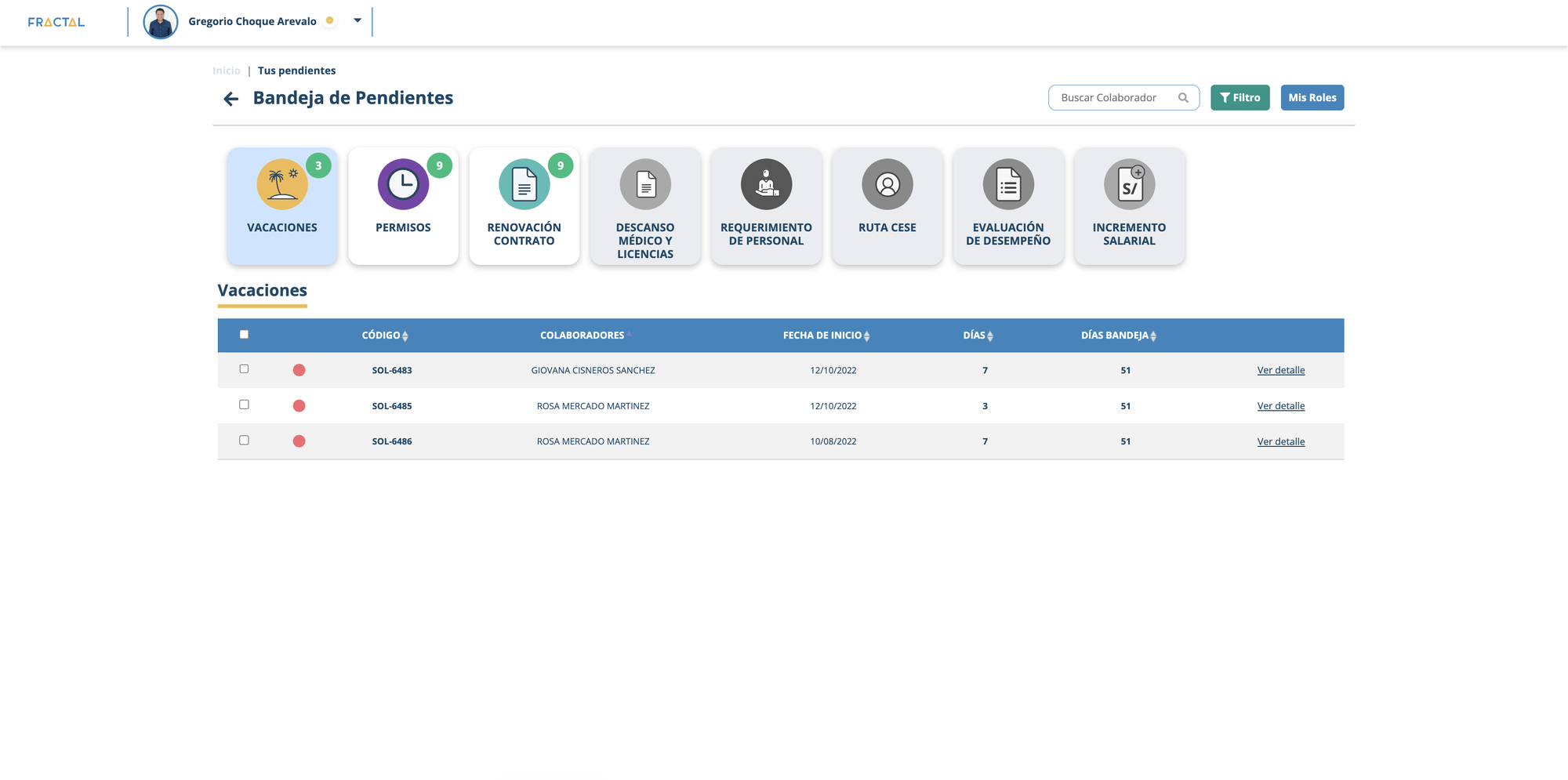
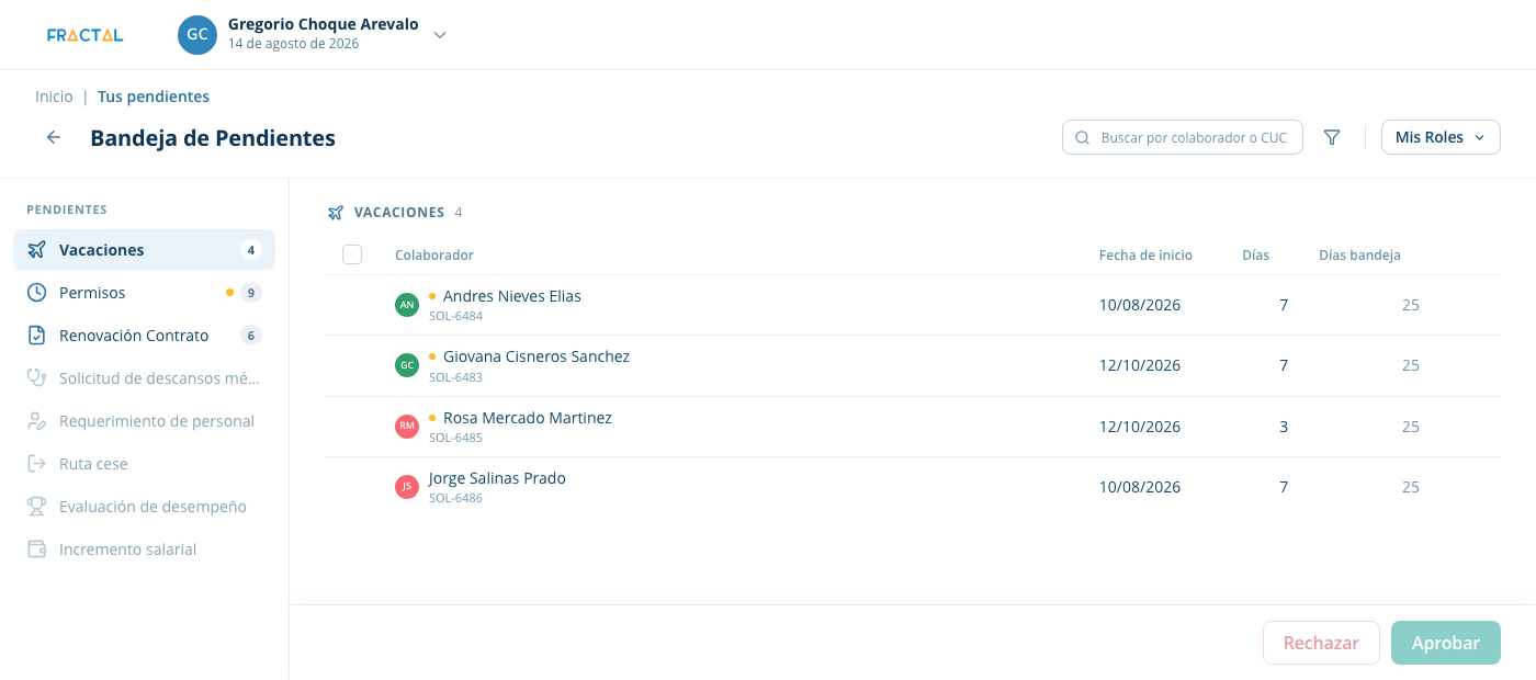
Moved categories to a sidebar. The old page showed big category tiles at the top, before any pending request. Now they're in a small sidebar with a count next to each one, and it's easy to add new categories later.
Kept it simple. The old screen had color and borders on almost everything. The new one uses more white space, so there's less to read and it's faster to scan.
Results
From 15 Slack pings a week to near zero.
After the design system launched, Slack requests for single screens almost stopped. Developers could find what they needed in the Figma file without asking me.
The redesign was released to clients, and the PM reported 30% fewer support tickets, thanks to the new request flows.
30%
Fewer support tickets after the design system and the redesign were released.
* Reported by the product manager after the redesign launched.
Key takeaways
What this taught me.
Start with the system, not screens
Designing without a shared base creates extra work for designers and developers. Building the design system first made every feature after it faster to design and build.
Part of the job is getting people on board
The team had worked the same way for years. To change it, I had to earn their trust, explain why it was better, and get everyone to agree first.
Key information should come first
People shouldn't have to search for what they need to make a decision. Showing it upfront, like the vacation balance at the top of the form, lets them act with confidence instead of relying on memory.
Fractal IA
Your company's documents, one question away.
Later on, I designed the experience for Fractal IA, an assistant that lets employees ask questions about their company's documents and procedures. Each employee only sees the documents from their own department, so the answers are always relevant to their work.
For employees. When someone needs to check a document or a procedure, they can just ask instead of searching through files.
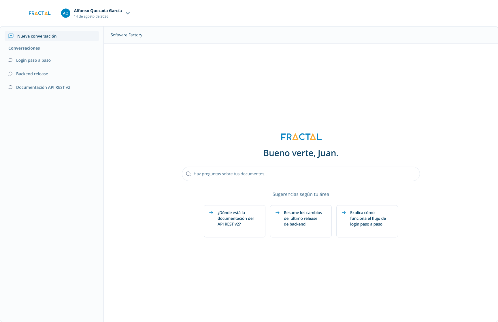
Suggestions based on your department. An empty search bar makes it hard to know what to ask. The home screen shows three questions based on the employee's department, so they have a clear place to start.
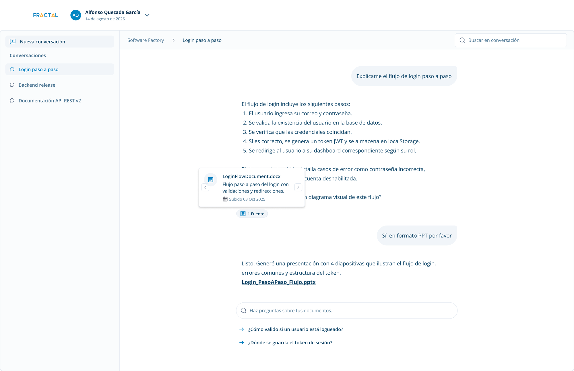
Follow-ups. After each answer, the assistant suggests related questions and offers next steps, like turning the answer into a presentation. That way people can go deeper without having to write the perfect question.
Citations. Every answer shows the documents it came from, with the file name, a short summary, and the date it was uploaded. People can check the source themselves, which helps them trust the answer.
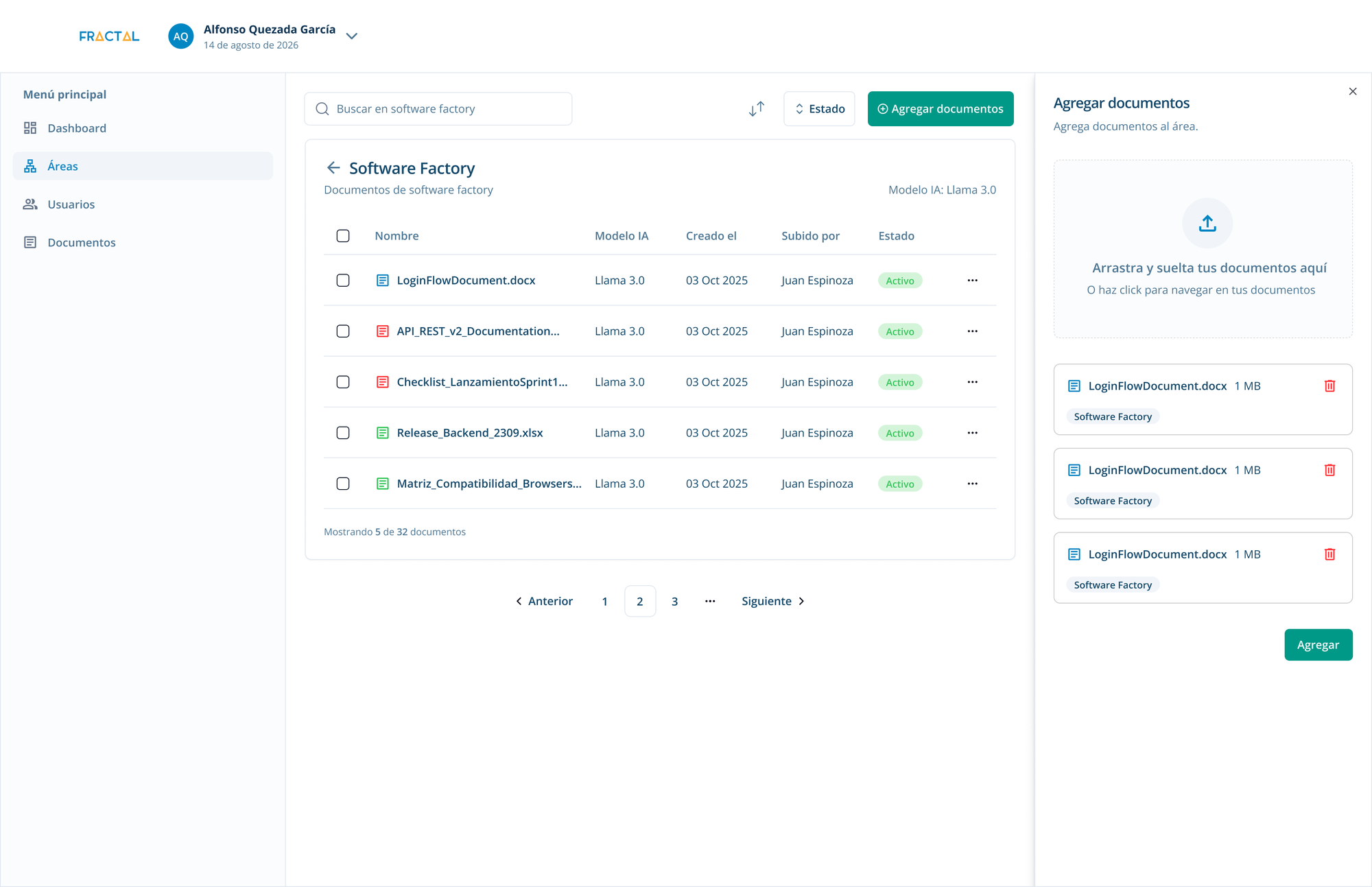
For admins. Fractal IA runs on a RAG system: it answers using only the documents uploaded to each department. I designed the admin side, where admins upload and organize those documents by department, so employees only get answers about what applies to them.
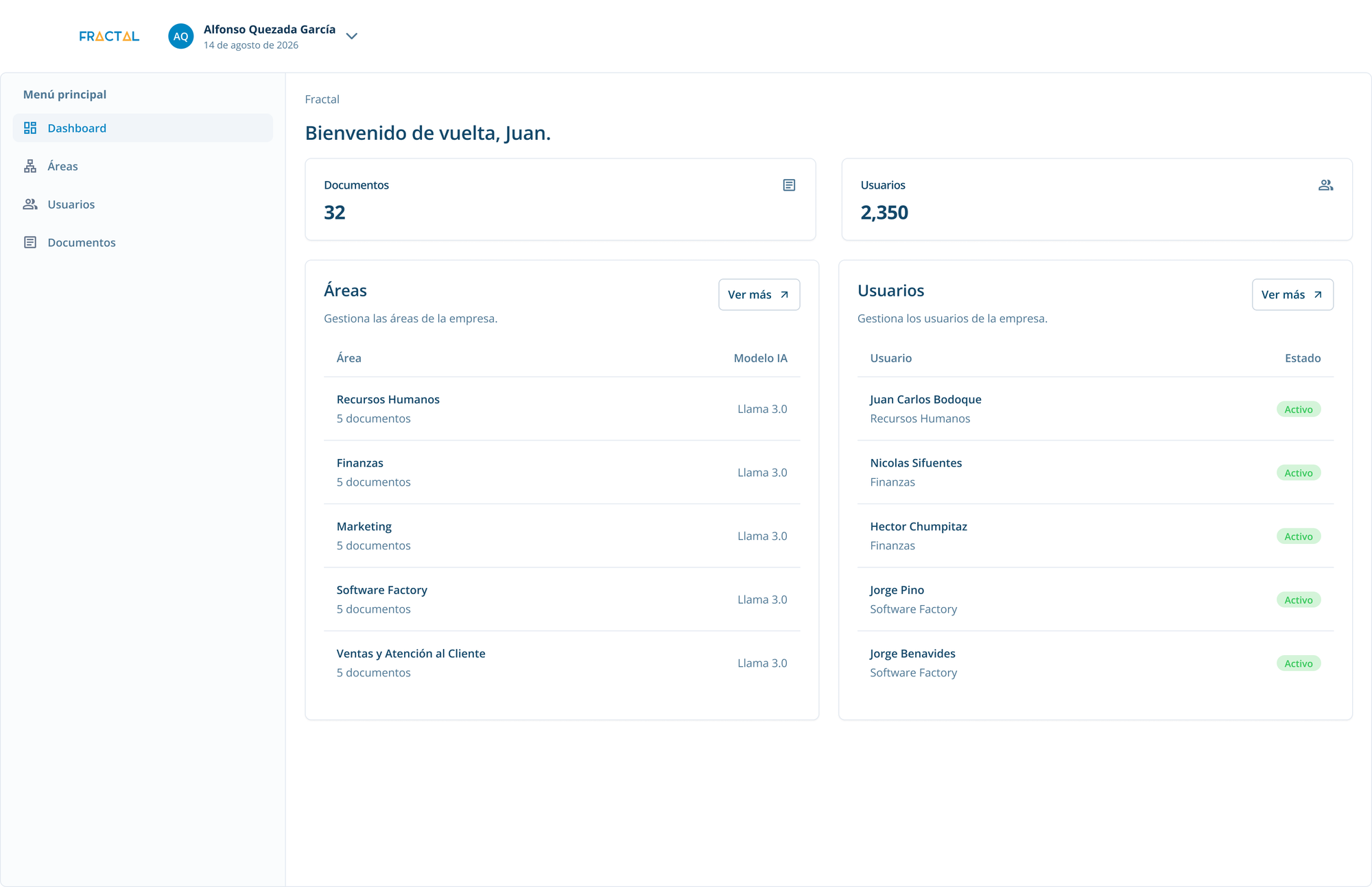
Documents organized by department. The dashboard shows each department with how many documents it has, so admins can quickly see which departments still need content.
Uploading without leaving the page. Admins drag and drop files into a side panel, check which department each one goes to, and add them all at once, without losing sight of the documents already there.