Joined Qamaq, an enterprise AI platform, to redesign it so it works for every skill level.
The platform was built for technical users: too much technical jargon and information overload.
Dashboards that change based on skill level, and a "build a solution" flow with two paths: guided or blank canvas.
69% of beginners who couldn't complete an agent without help can now do it on their own.
Overview
One platform, every skill level.
Qamaq is an enterprise AI platform that lets teams consult internal documents, automate workflows, and build custom solutions all-in-one.
I joined Qamaq as a Product Designer to redesign a platform that had been built by the CEO and the dev team but was only really working for technical users. The challenge was clear: make it adaptive for every type of user, regardless of their skill level.
Working directly with the CEO, I led the full redesign of the platform's core flows. This included designing the new level-based dashboard and completely rethinking the "build a solution" experience.
The problem
Built for technical users, by default.
The platform was solid, but it was built assuming everyone already knew how to use enterprise AI. Two things kept coming up.
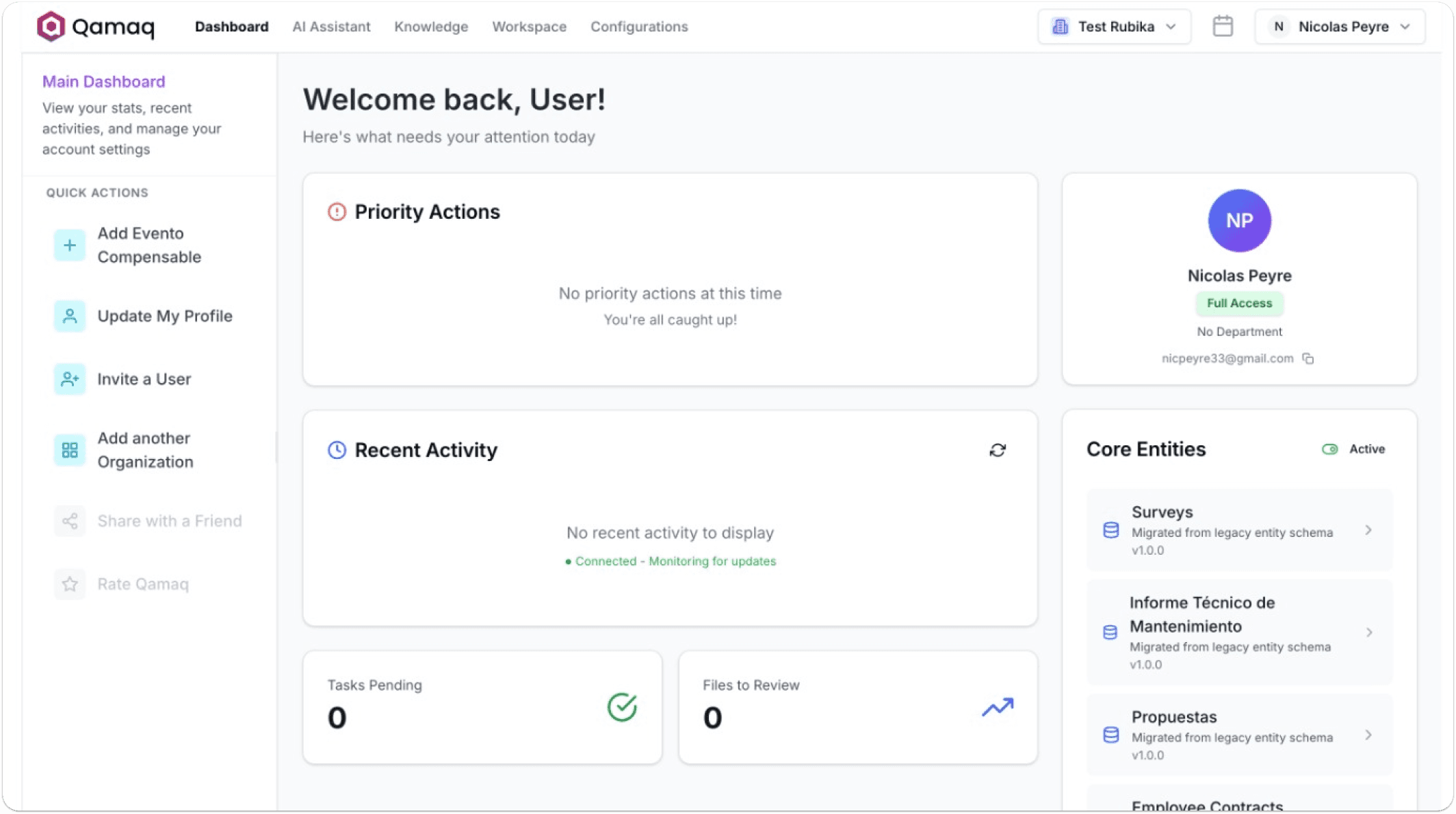
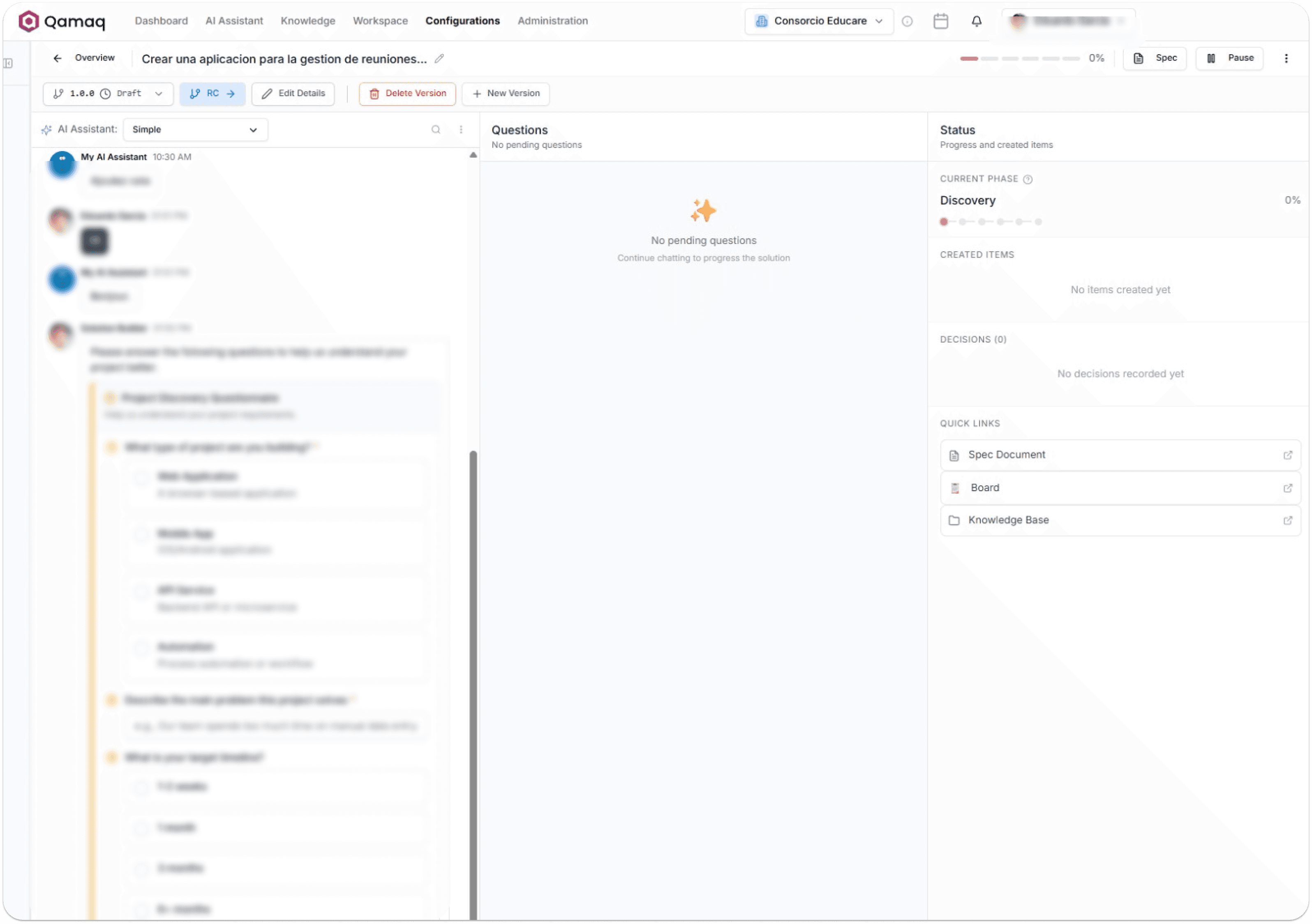
My approach
Keep the power. Lose the overload.
My approach was to keep Qamaq's full enterprise power while making it work for non-technical users. Three things had to happen.
Competitive audit
Use the patterns people already know.
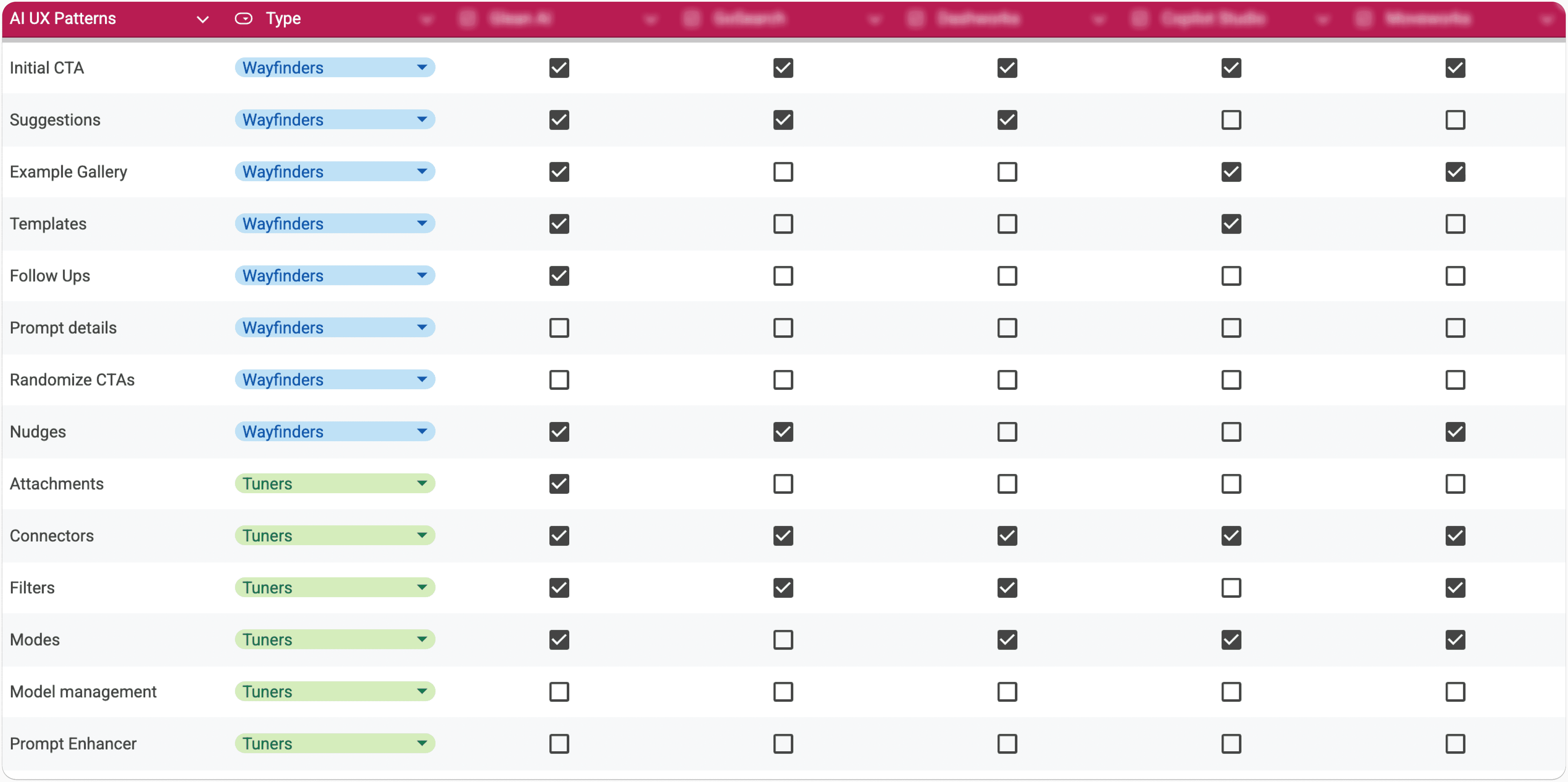
To map all necessary components to include in the dashboard, I ran a competitive audit, identifying core features and user flows across top competitors.
The best dashboards build on patterns people already recognize, not ask them to learn new ones. So instead of designing from scratch, I used AI UI patterns people already know: initial CTA, example gallery, AI suggestions. The result was a dashboard that felt intuitive from the first click.
User personas
Three skill levels, three sets of needs.
Then I mapped users into three skill levels and used them to drive every design decision from that point on: Beginner, Intermediate, and Advanced, each with distinct needs, expectations, and comfort levels with enterprise AI tools.

Sarah Lee the beginner
Lifestyle
- Focuses on business efficiency, not technology.
- Relies heavily on standard SaaS tools like Slack, Workday, Notion.
Goals
- Automate simple, repetitive tasks without asking anyone for help.
- Rely on guided experiences and pre-built templates for guaranteed success.
Pain points
- Doesn't know where to start with an open "blank canvas," like a standard ChatGPT prompt box.
- Intimidated by technical jargon and complex dashboards.

Mark Tyler the intermediate
Lifestyle
- Tech-savvy, though not a formally trained software engineer.
- Familiar with low-code automation tools, like n8n.
Goals
- Have enough freedom to build and modify workflows without writing a single line of code.
- Quick access to what's already running, picking up where he left off instead of starting from scratch.
Pain points
- Standard beginner templates are way too rigid and limiting for his needs.
- Full developer environments are too complex and require too much technical knowledge.

James Miles the advanced
Lifestyle
- Deep technical expertise and understanding of AI behaviors.
- Comfortable writing code and building complex data systems.
Goals
- Build complex, custom AI agents and multi-step workflows from scratch.
- See the health of all his solutions and spot issues the moment he logs in.
Pain points
- Interfaces that are too simple to do his job.
- No visibility into how his automations are actually performing.
Dashboard design
A dashboard that adapts to who's looking at it.
Key decision. The founder resisted simplifying the interface, worried it would make the platform less powerful. I argued that simplicity doesn't mean less capable, it means less overwhelming. So we met in the middle: advanced users keep every feature, and everyone else gets a guided way in.
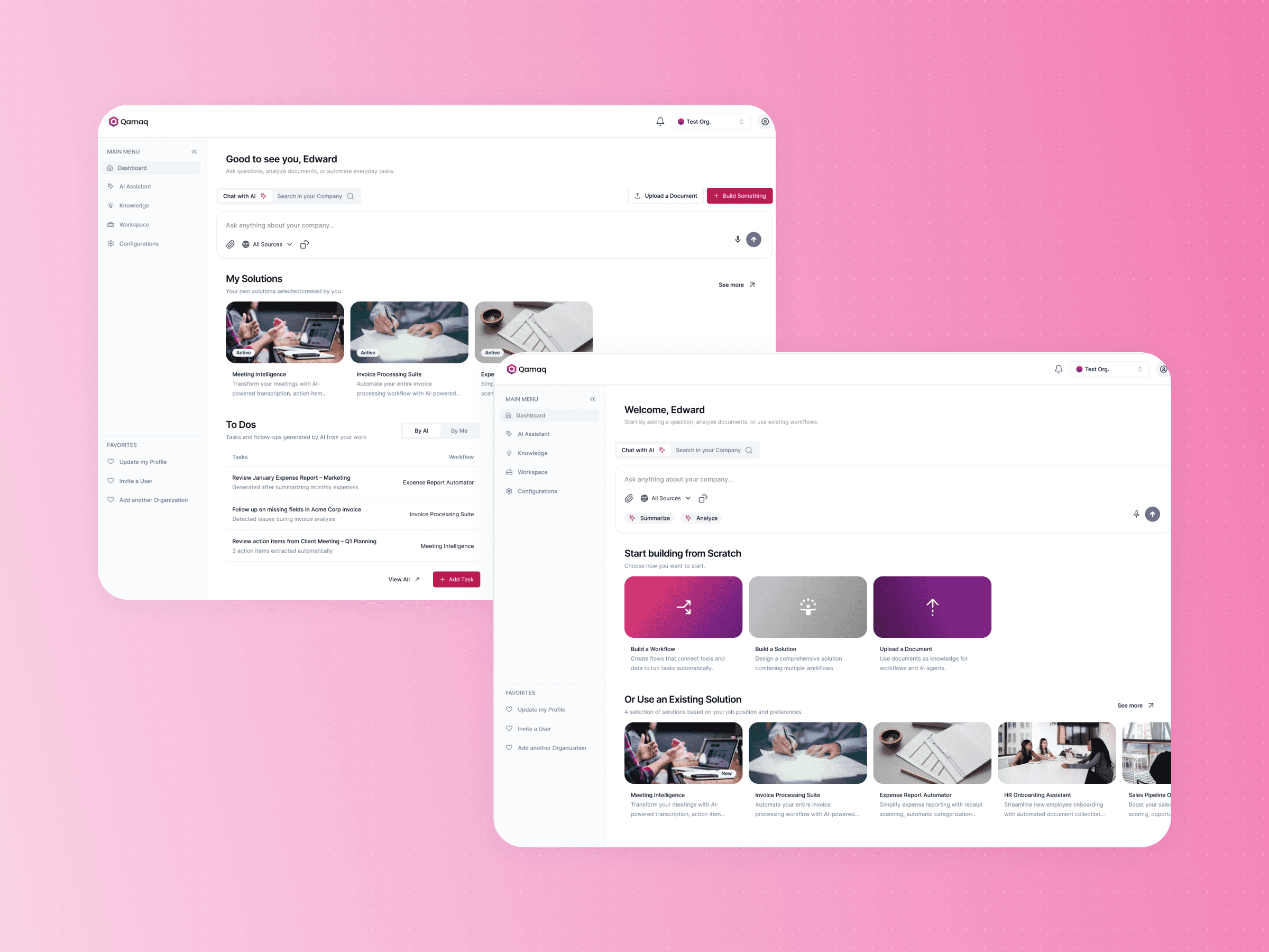
Dashboard for beginners
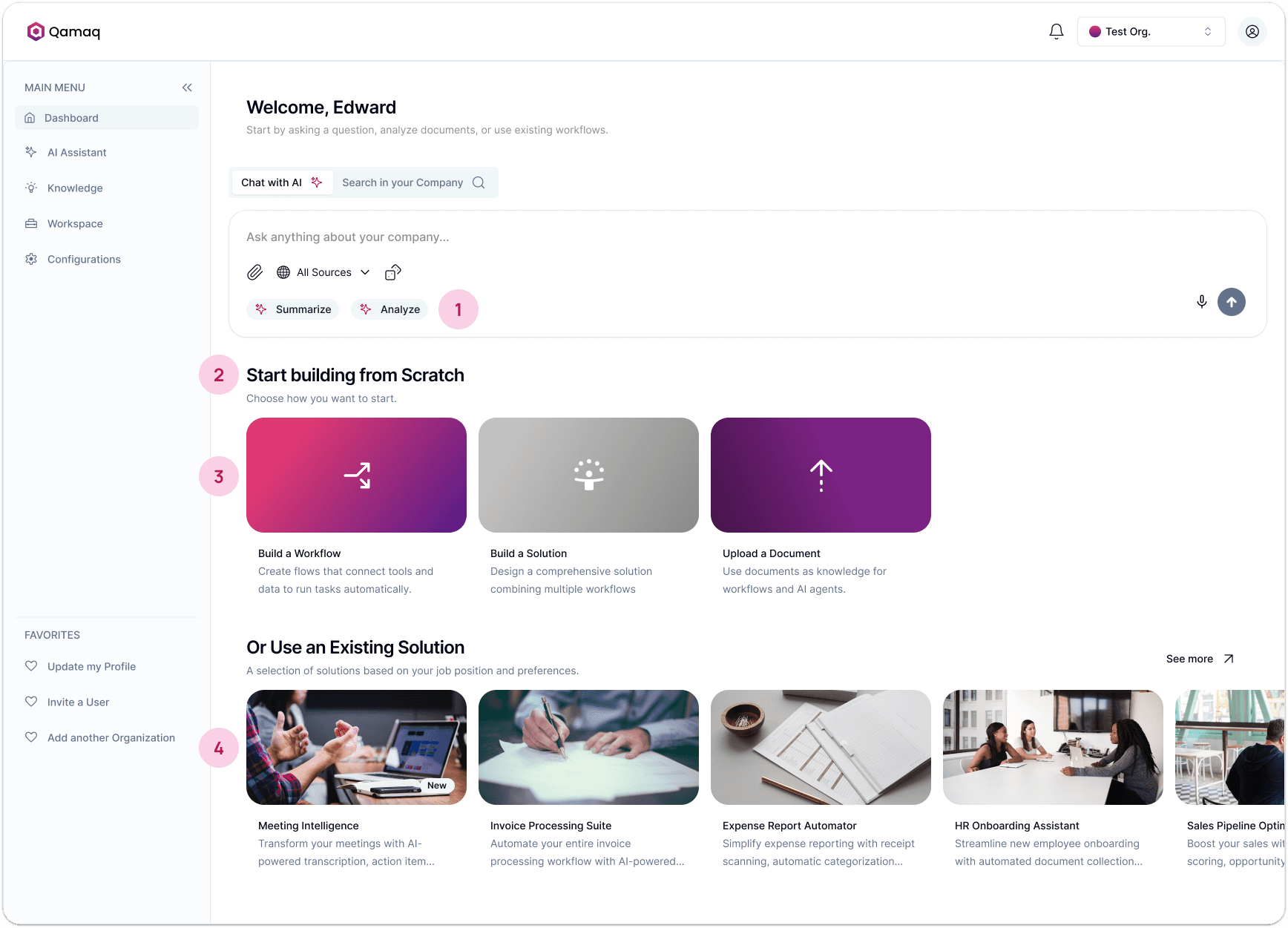
Guided CTA with AI suggestions. Shows users what they can do before they even start typing. No blank box, no confusion.
Clear section headlines. "Start building from scratch" and "Or use an existing solution" tell users exactly what their options are without making them think about it.
Prominent main actions. The core creation paths are big, colorful, and impossible to miss.
Example gallery. Instead of an empty platform, users land on a page that already shows what's possible, so they learn without a tutorial.
Dashboard for intermediate users
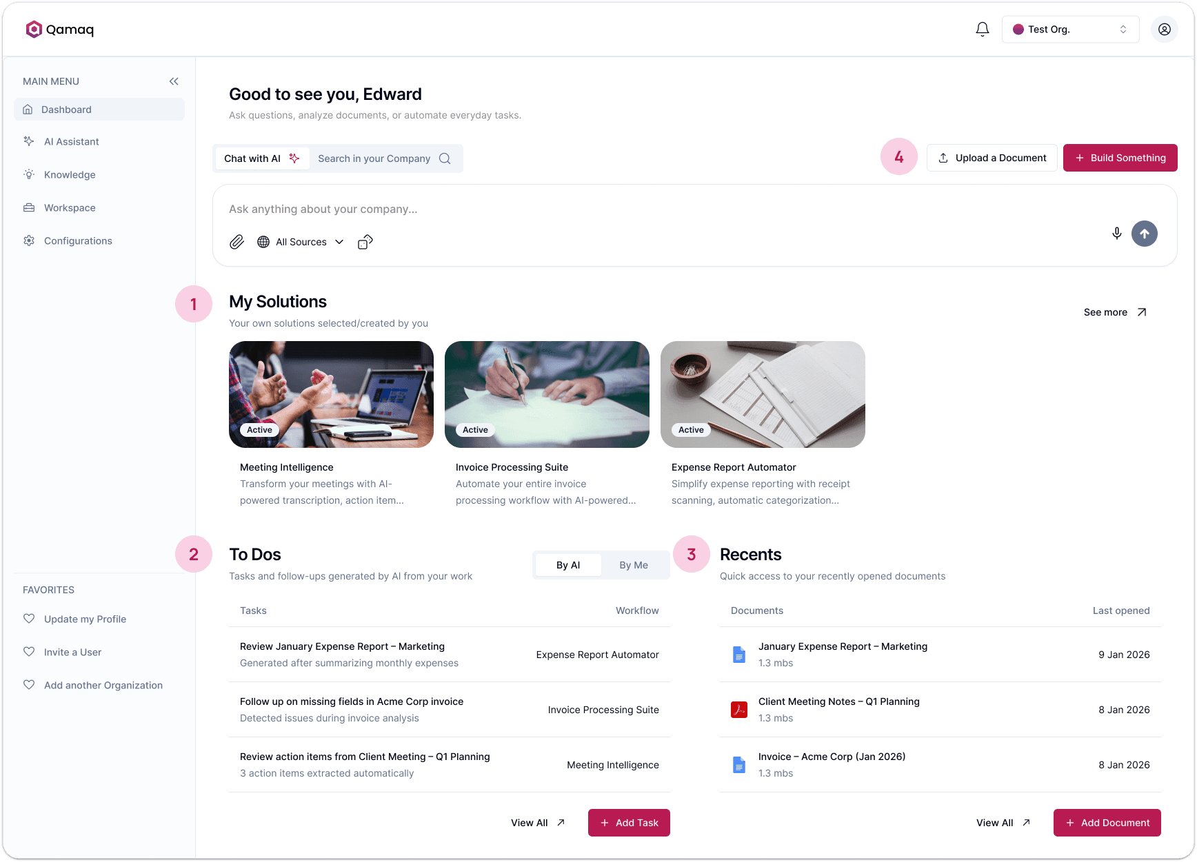
Active solutions up top. They already have things running, so that's the first thing they see.
To Dos up front. AI generated and manual tasks sit right there on the dashboard.
Recent documents. The files they've already been working with show up automatically.
Simplified actions. The big CTAs shrink to compact buttons because they already know what they want to do.
Smarter suggestions inside the chat. Personalized based on their actual history.
Dashboard for advanced users
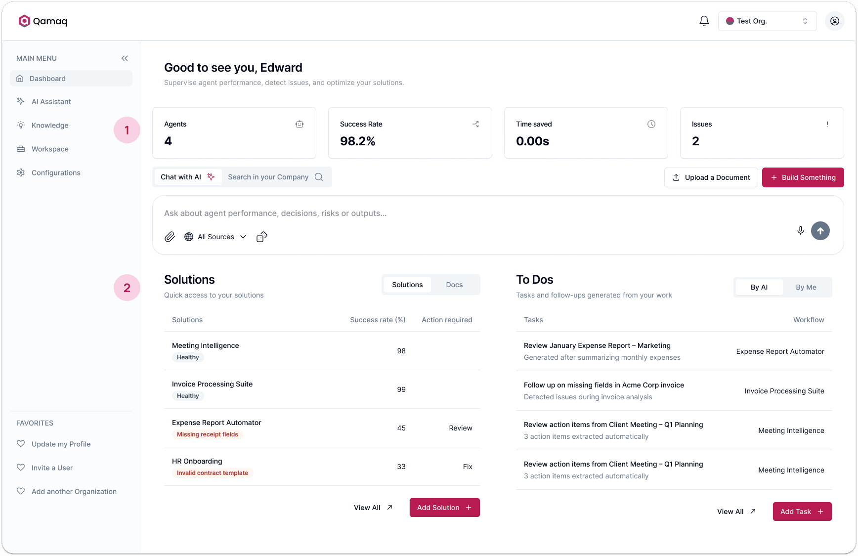
Performance metrics up top. Agents active, success rate, time saved, open issues.
Solutions as a table. No visual cards, just status indicators, success rates, and flagged issues they can scan in seconds.
Build a solution flow
Guided for beginners, blank canvas for experts.
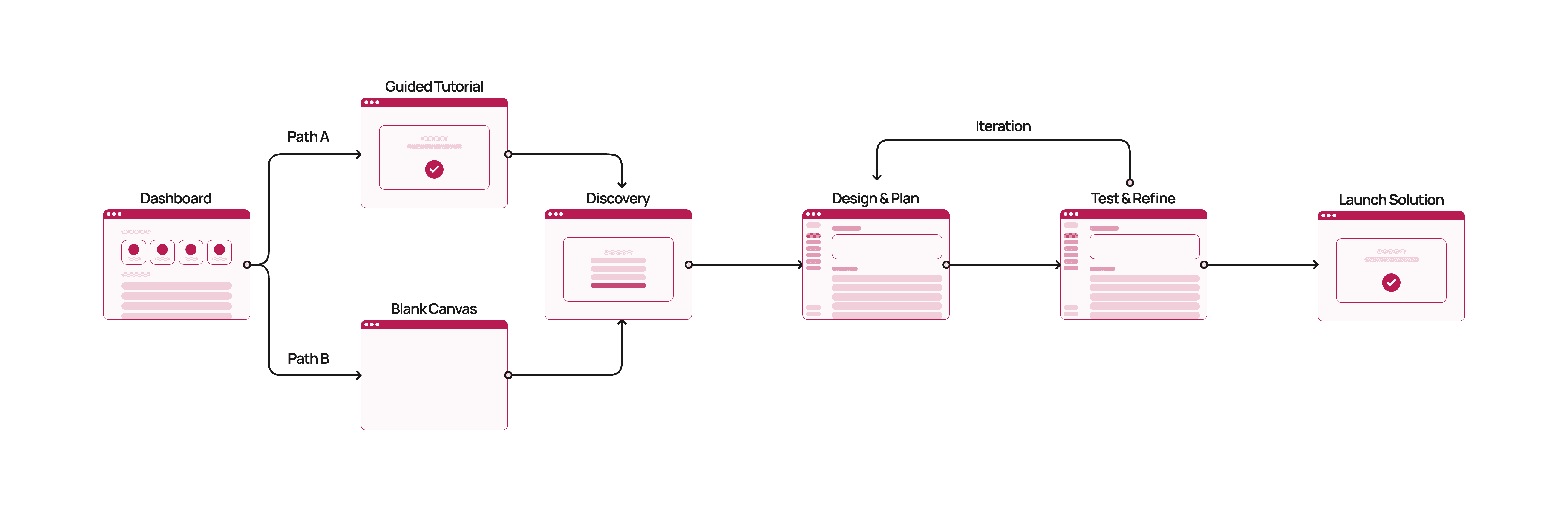
The next challenge was what happened when users tried to build something. I redesigned a flow that actually guided beginners through the process while letting advanced users skip straight to what they needed. Intermediate users could pick either path: the guided tutorial if they wanted the extra support, or the blank canvas if they already knew what they were doing.
Path A: Beginners
Guided tutorial. Instead of a blank canvas, the platform walks them through it, asking simple planning questions and generating a visual plan before it builds anything.
Path B: Advanced users
Blank canvas. No guidance, no extra steps. They land directly in the builder with full control from the start.
Guided tutorial for beginners
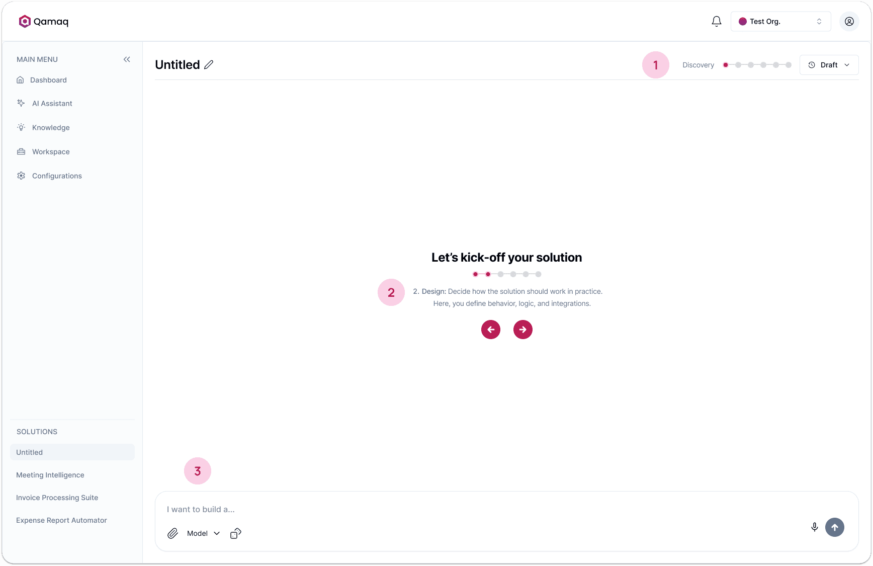
Progress indicator. Beginners can see exactly where they are in the process. It feels achievable instead of overwhelming.
Step-by-step instructions. Shows exactly what to do at each phase, so the user always knows what to expect next.
Guiding microcopy. The chat tells users exactly what kind of input is expected at each step.
Solution builder redesign
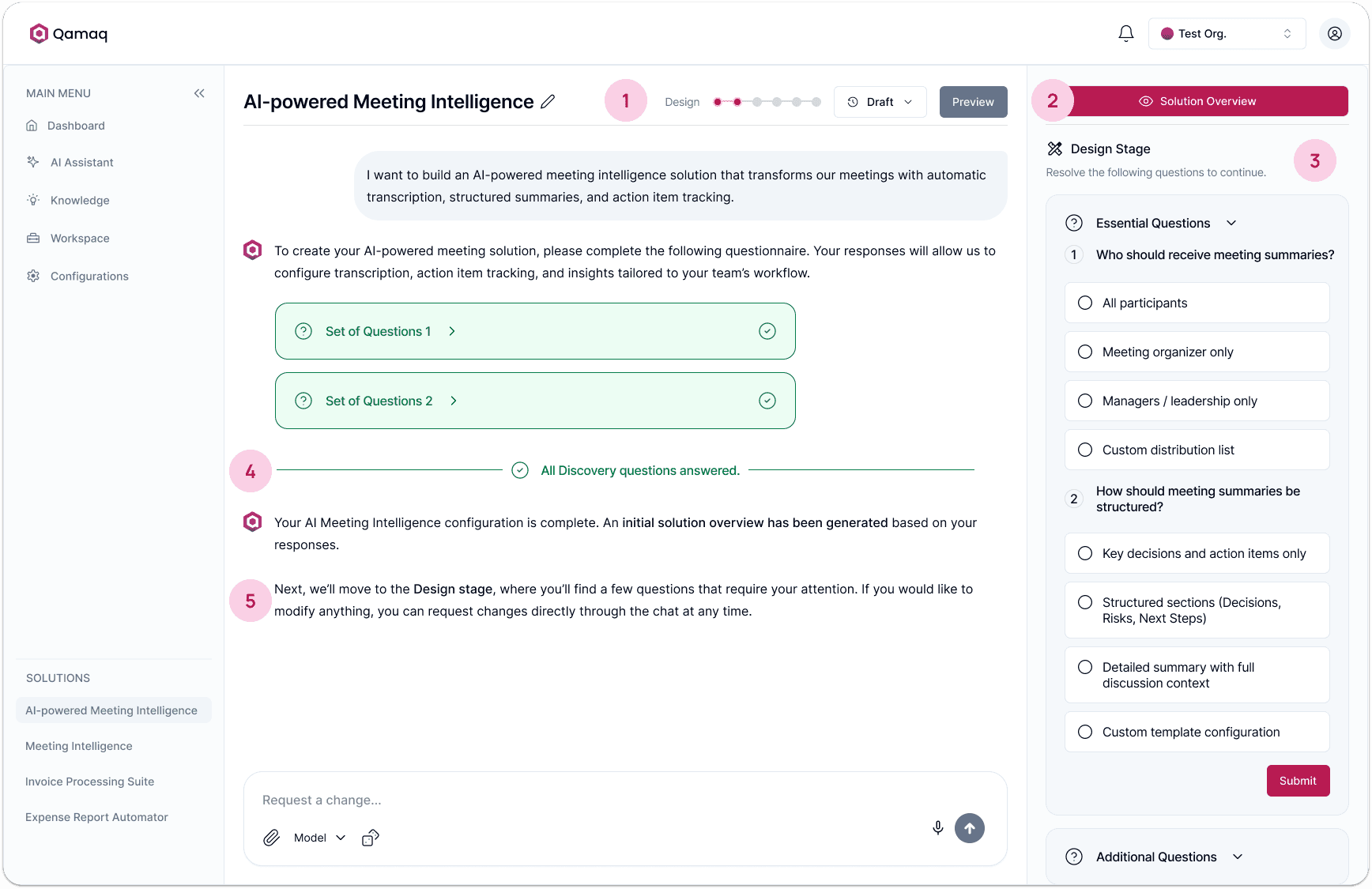
Cleaner navigation. Removed extra settings and version controls from the top bar.
Prominent CTA. Replaced the easy-to-miss "Spec Document" link with a more visible button.
Merged sidebar. Merged the middle column into the sidebar, adapting to the current phase.
Phase dividers in the chat. A visual marker appears when a step is done, keeping the conversation easy to follow.
Adaptive guidance. The AI adjusts how it talks based on who's using it: step by step for beginners, straight to the point for advanced users.
Results
From idea to live agent, without help.
Previously, non-technical users couldn't build an agent without support. Now, a first-time user can go from zero to deployed, on their own.
By combining established AI UX patterns with adaptive guidance and clear microcopy, we made the platform usable for the people it was meant for.
69%
Of beginners who couldn't complete an agent without help can now do it on their own.
* Data from user testing conducted after the redesign.
Key takeaways
What this taught me.
Simple doesn't mean less capable
Showing fewer options at a time lowered the cognitive load and guided users to the next step, without taking away anything the platform can do.
Familiar AI patterns speed up learning
Using UX for AI components people already know, like a prompt box, suggestions, and follow-ups, meant users understood how they worked right away instead of learning something new.