Ciudapolis: Real Estate management mobile app redesign
Increased task effectiveness by 30% and reduced task completion time by 40%
Role
UX/UI Designer
Industry
Real Estate
Duration
2 months


High-fidelity mockups
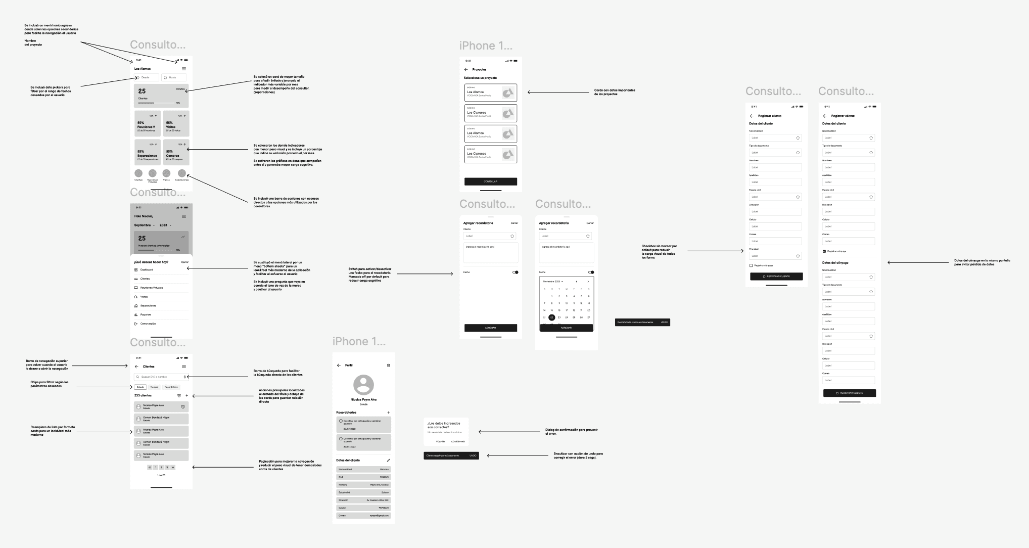
With the structure validated through wireframes and user testing, I moved on to the high-fidelity design phase. This step focused on bringing clarity, visual hierarchy, and consistency to the interface, while integrating the improvements identified during testing and user research.
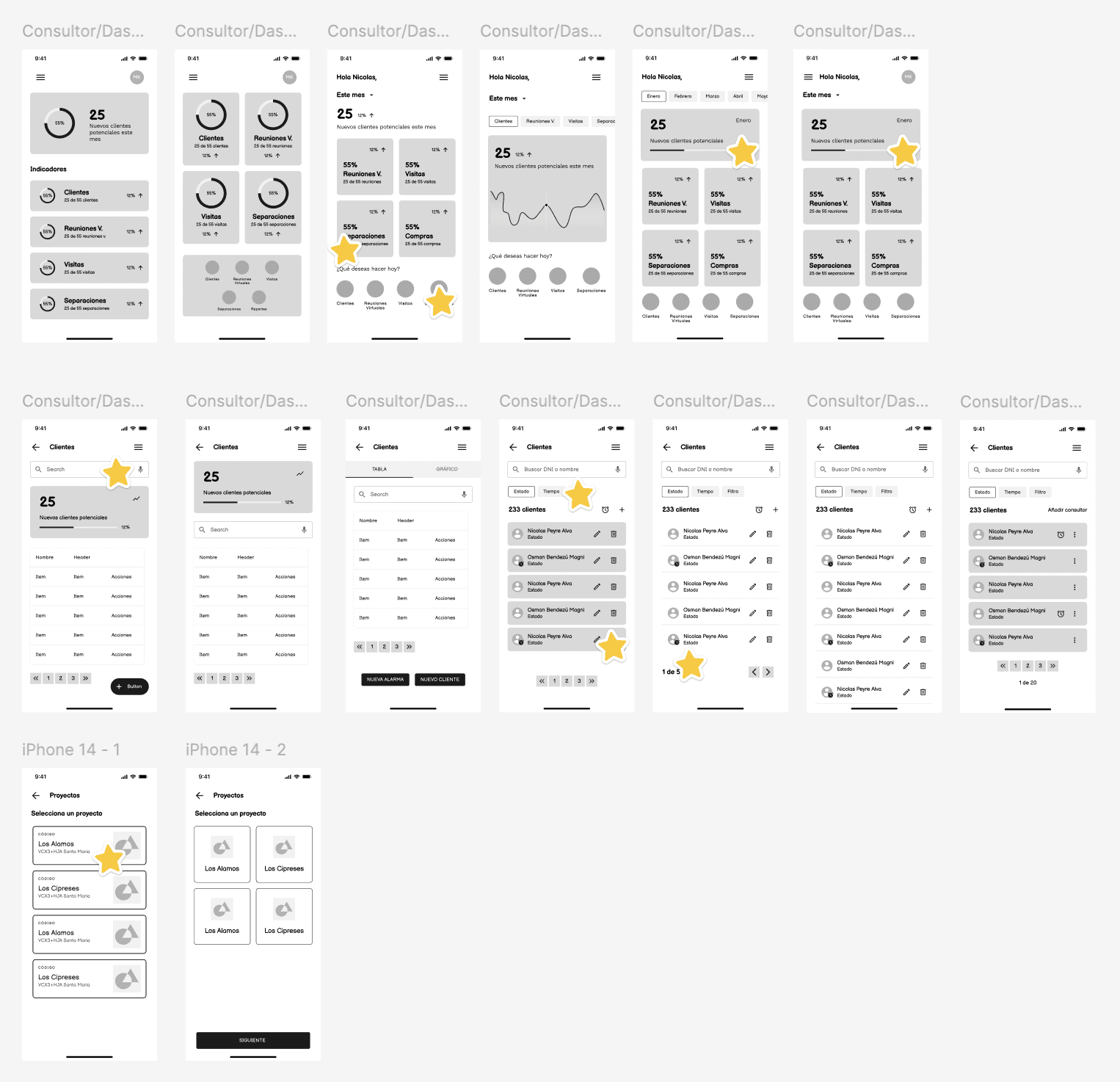
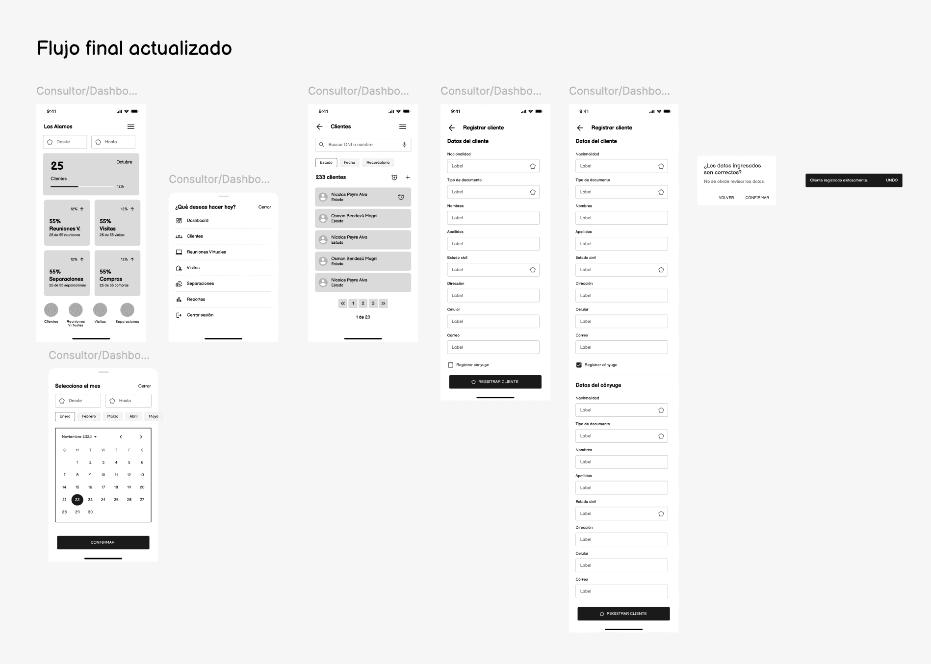
Final UI Overview
Here’s a high-level look at the redesigned Ciudapolis app for consultant's flows. The interface reflects all the improvements driven by research, testing, and stakeholder feedback, from dashboard KPIs to client creation, date filtering, and interaction feedback.
This snapshot showcases:
Visual hierarchy and consistent UI components
Scalable navigation and filters
Improved mobile accessibility and spacing
Clear CTA placement and form readability

Before & After: Client Listing for Consultants

In the original version of the client list (left), several critical issues from the heuristic evaluation and usability testing were clearly visible:
The screen suffered from poor visual hierarchy , all elements had similar visual weight, making it hard to scan.
There were unlabeled icons in multiple colors, violating the match between system and real world principle.
The action buttons were too small and tightly packed, increasing the risk of accidental taps and violating error prevention.
The primary CTA (“+”) lacked visibility and affordance
Pagination was limited to “1 2 3” with no orientation cues, making navigation hard.
In the redesigned version (right), I addressed these issues by:
Applying a cleaner visual hierarchy: user photos, names, and status are visually distinct and aligned for easy scanning
Replacing unclear icons with role-specific labels and icons to improve recognizability
Introducing a prominent, labeled “+ Create Prospect” CTA with sufficient size and contrast
Improving spacing and reducing per-row actions to minimize mis-taps
Redesigning pagination with arrows and item counts
This update directly tackled multiple usability issues while making the interface feel sharp and easier to use.
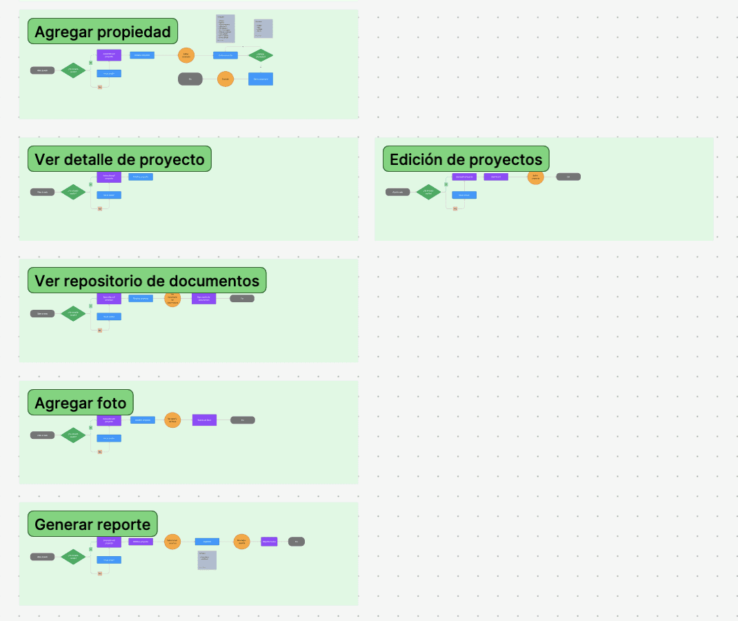
High-fidelity Prototype
After designing the final screens, I created a high-fidelity prototype for each user role to simulate the full interaction experience and present it to stakeholders. This allowed us to validate the flow logic, transitions, and task completion across different user journeys.
For this case study, I’m showcasing only the Project Manager (PM) flow, which includes key tasks such as navigating projects, editing listings, viewing lots, applying filters, and generating reports.
Other role-based prototypes (e.g. CEO, Consultant, Administrator) are available upon request for private review.

Outcomes
Testing the design
After completing the high-fidelity redesign, I ran a second round of usability testing using Maze with 5 real estate consultants. The goal was to validate improvements made to the most critical user flows, such as viewing the dashboard, adding a new client, and filtering the prospect list.
+30%User Effectiveness | -40%Task Completion Time |
The results showed clear improvements in both efficiency and success rate:
Task success rate increased from 62% to 92% across main flows
Average task completion time dropped by 40%, with most users completing actions in under 1 minute
All participants found the redesigned version easier to navigate and more intuitive, with comments highlighting clearer labels, better layout, and reduced cognitive effort
These results confirmed that the design changes addressed the original pain points, making the experience smoother, faster, and more aligned with real consultant needs.
Takeaways
Some key lessons I took away:
IA before screens: Starting with sitemaps and flows for each role helped me design a scalable product architecture and guide design decisions
Collaboration drives clarity: Bringing stakeholders into early design decisions (through wireframe comparisons and annotated prototypes) aligned expectations and accelerated iteration.
Small UI details have big UX impact: Elements like button size, icon clarity, and spacing significantly affected user confidence and task performance.
Other projects

Weever.ai: Evaluating trust and usability in an AI shopping assistant
Uncovering what makes AI feel human and trustworthy

Fractal: SaaS HR platform redesign
Reduced internal HR support tickets by 25% and increased user satisfaction in request submission flows by 18%.

Zaddons: Vacation bidding flow audit for HR SaaS platform
Reduced HR support tickets by 22% and improved task efficiency by 30%.